
If you're looking for tips on how to write FAQs that actually help your customers then you've come to the right place.
The sad truth is that most FAQ pages are dreadful.
Unlike sales pages, FAQ pages seemingly don’t offer any direct return on investment. And that’s why lots of folks end up slapping their FAQ section together as an afterthought.
But that’s a huge mistake. Because a good FAQ page is an outrageously valuable asset.
Just think about it.
A great FAQ page acts as a self-service portal that guides your customers to the answers they need. In turn, you decrease the burden of your customer support reps as they'll be dealing with fewer incoming customer support tickets. This means your company will be able to provide better customer support as your reps will be able to focus on more pressing issues.
Not only that but a great FAQ page can improve your website's organic traffic and navigation.
Plus it's potentially a critical moment in the conversion funnel. Because a trip to your FAQ page means a visitor is indicating they’re interested in knowing more about the details of your product or service.
So, if you’ve been neglecting your FAQ page, now is the time to give it the attention it deserves.
In this article, we'll discuss:
Without further ado, let’s jump in and learn how you can craft a watertight FAQ page to bring in more sales and increase your customer satisfaction at the same time.
What is an FAQ Page?
An FAQ page (short for Frequently Asked Question page) is a part of your website that provides answers to common questions, assuages concerns, and overcomes objections.
It’s a space where customers can delve into the finer details of your product or service, away from your sales-focused landing pages and homepage.
At Helpjuice for example, we use our knowledge base software to build an FAQ page that helps our users get the most from our product. It’s a one-stop shop for the most common questions that keep popping into our customer’s minds.
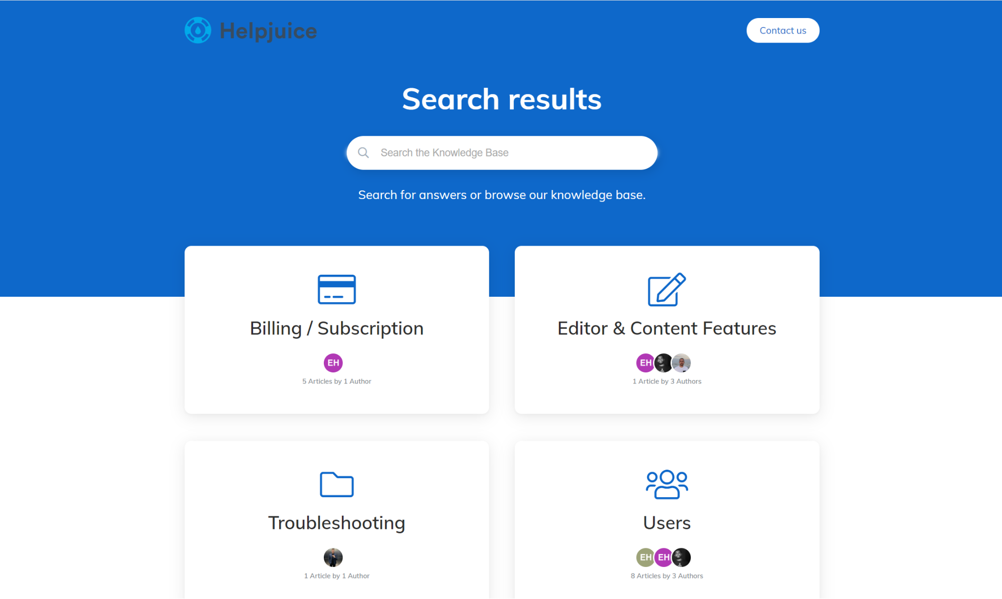
Aside from simply troubleshooting your customer’s problems, when done well, your FAQ section becomes a powerful tool that can:
- Boost sales by washing away your customer’s pre-purchase fears and concerns
- Aid in ticket deflection by providing customers the ability to self-serve and find the answer to their problems on their own
- Pull in more traffic by improving your site’s search visibility
- Give your customers a more enjoyable overall experience
So, as you can see, a good FAQ page has buckets of potential. It’s a lot more than just a place for customers to check your returns policy. But how do you go about creating a first-rate one?
How to Write an Effective FAQ Page
Creating an FAQ page might seem like a walk in the park. But if you just jump in without a plan, you’ll end up with subpar results.
Thankfully, it’s not rocket science. And with a couple of simple tips on what should be included in your FAQ, you can elevate your FAQ page to FAQ’in awesome heights!
1. Include Real Frequently Asked Questions
Don’t laugh. This one seems blindingly obvious. But you’d be surprised at the number of FAQ sections that don’t adhere to this simple principle.
There’s nothing worse than visiting a FAQ section to find a bunch of patronizing questions designed to showcase how wonderful the company is. Don’t do that.
Instead, scour your ticketing system and interrogate your customer support reps to determine the actual issues your customers are struggling with.
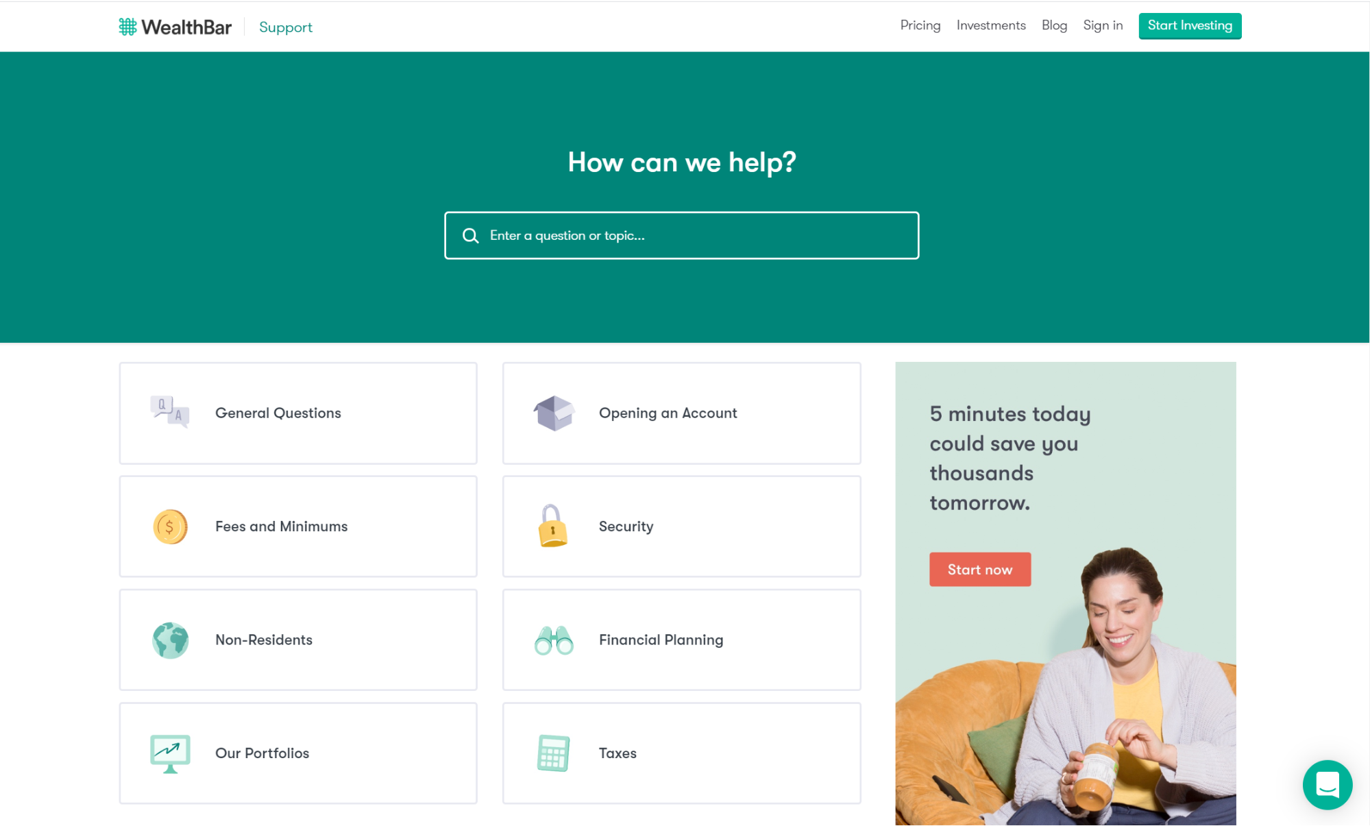
(Source)
Your social media channels can be a useful source of customer frustrations too. And don’t be afraid to ask your audience about what they’re wrangling with.
If you’re just starting out, it’s ok to look at competitor websites to see what problems might pop up in the future.
Once you’ve done your research, figure out what queries keep presenting themselves over and over.
Throw them into a spreadsheet and rank ‘em by importance. These will form the basis of your FAQ page.
2. Keep it Simple & Organized
People aren’t coming to your FAQ page to get their fill of beautiful prose. They want short, sharp answers for questions related to your business.
So, keep your solutions brief and to the point. Ruthlessly chop down any overly wordy answers, and break-up longer answers into easy to consume paragraphs.
Instead of stuffing as many answers as possible onto a single page, think about breaking up your FAQ section into skimmable sections.
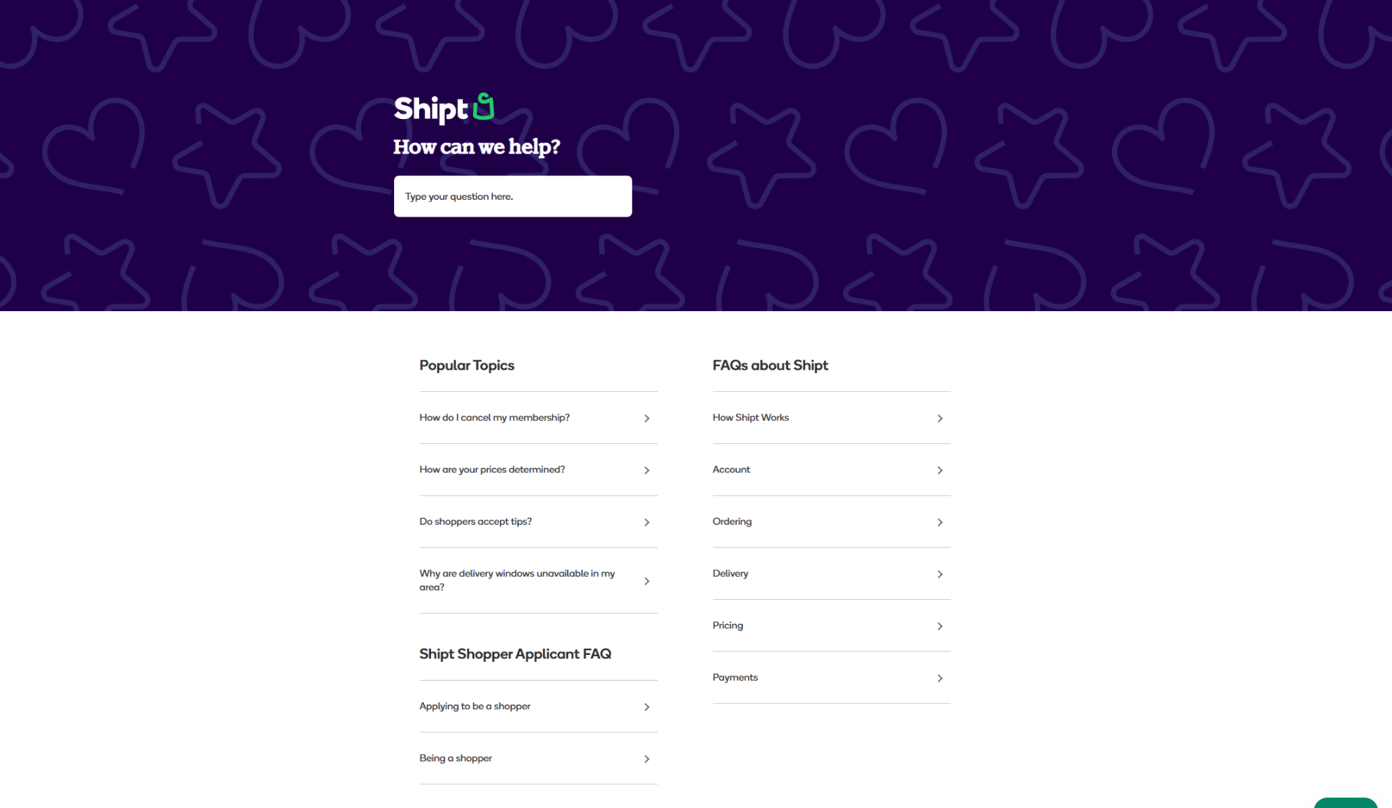
(Source)
Categorizing common questions helps users quickly find what they’re looking for. Use topics like ‘Billing’ or ‘Delivery’ to point users to the relevant advice, instead of having them contact you.
Do whatever it takes to simplify your FAQ page. Your users will appreciate your efforts.
3. Make it Searchable
Have you ever landed on an FAQ page only to be forced to scroll through hundreds of irrelevant questions to find what you’re looking for?
It’s certainly not the best way to spend 10 minutes.
So, take the pain out of the process and let your customers pop a query or keyword into a search bar to get the answers they need in a couple of seconds.
4. Optimize For SEO
In addition to lowering the friction for a visitor to make a purchase, your FAQ section can also help you to create a more search-engine friendly website.
By linking each of your questions to a separate page, you’ll help Google to show your answers to the people looking for them.
For example, if somebody Googles ‘How to install Helpjuice’ they’re led directly to our FAQ page:
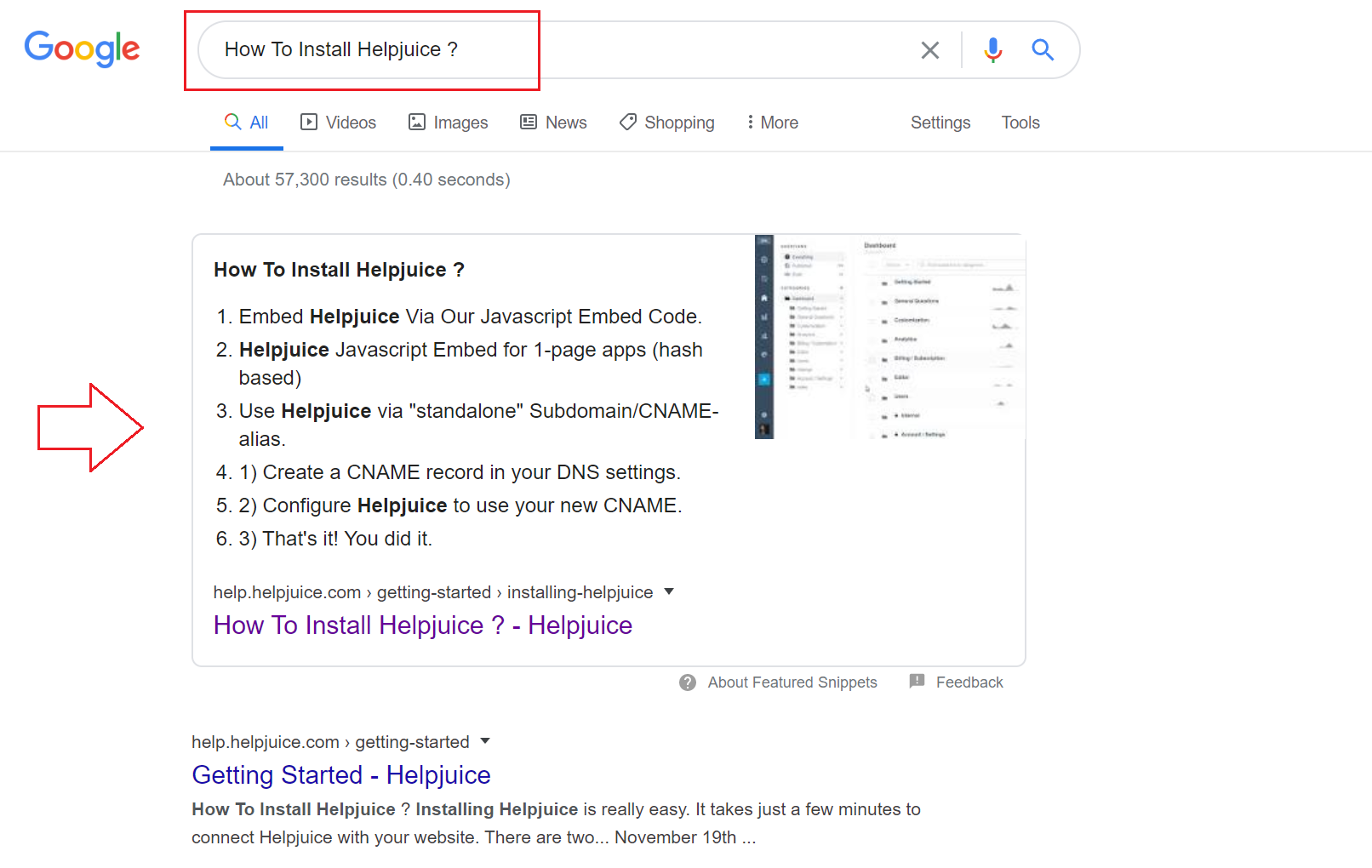
Even if people aren’t searching directly for your business, they might be looking for help with a problem you can solve. A properly keyword-optimized FAQ page can lead them right to your door.
5. Update Regularly
We’re going to say it: an outdated FAQ page is worse than not having an FAQ page at all.
So, commit to updating your FAQ section on a regular basis. Once every quarter is good or whenever you roll-out a new feature, product or update.
Over time, you’ll find that some questions become more popular than others and so need to be moved to be more visible. Other times, some questions will become redundant and need to be removed.
Regular edits and additions are essential to give your customers the best experience possible. Using the right knowledge base software makes it easier to manage, update, and analyze your FAQs over time.
12 Examples of the Best FAQ Pages
Okay, so you’ve got the basic FAQ best practices down - Awesome!
Now we’re ready for some serious FAQ design inspiration. Let’s jump into 12 of the best FAQ pages out there right now and see what we can learn!
1. Airbnb

(Source)
Airbnb has long been a titan in the world of UX. So, it’s no surprise that their FAQ section is another example of a beautiful human-focused design.
Airbnb caters to both travelers and hosts so they make it extremely easy to navigate to the relevant section with large clickable, animated buttons.
Below that, they link to separate articles for the most commonly asked general questions. Letting you quickly scan and find what you’re looking for.
Can’t see your question? Not to worry, simply pop it into the search bar at the top of the page and voila.
2. Headspace
(Source)
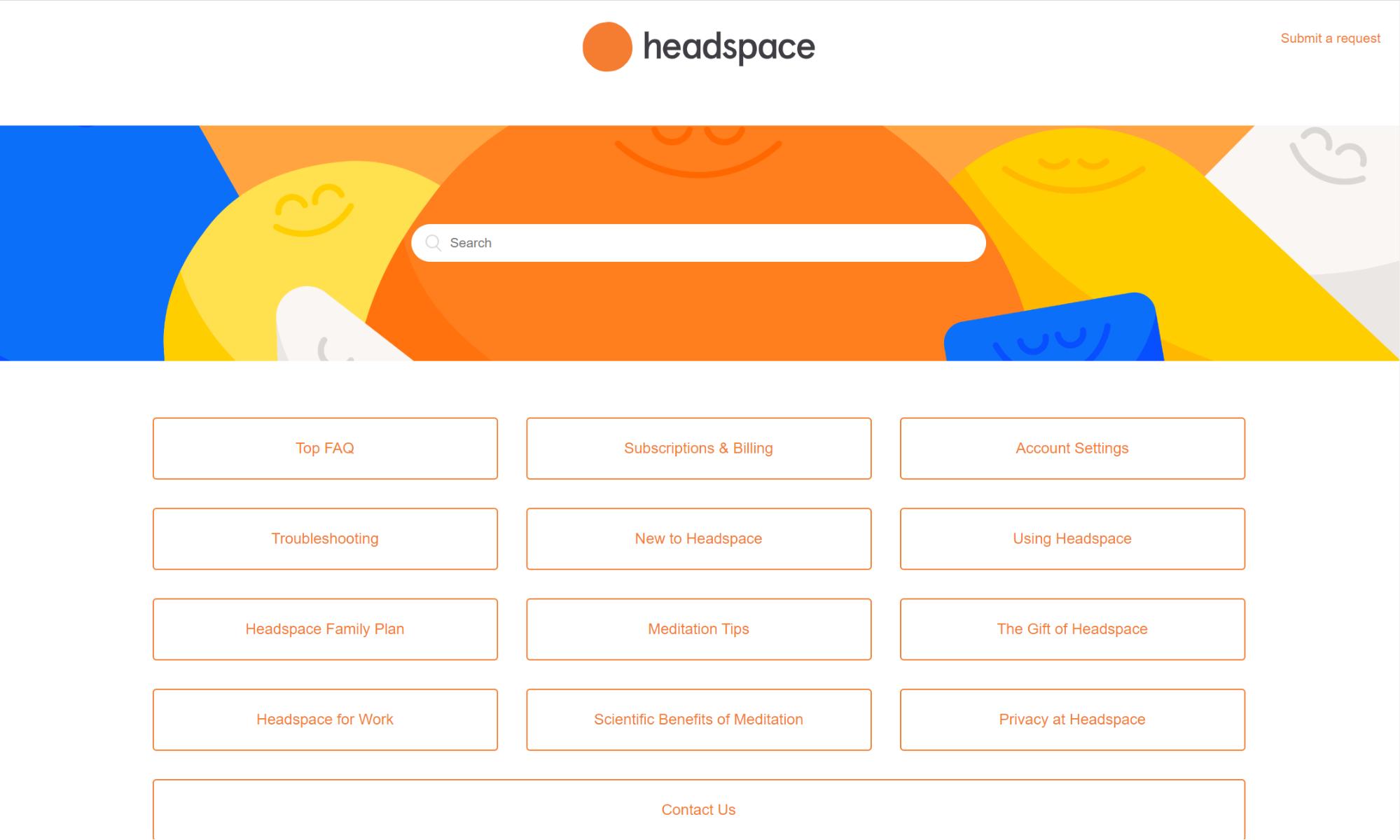
Meditation app Headspace’s goal is to relieve stress and promote calmness. And you can certainly see that goal reflected in their FAQ section.
They lead with a search bar before neatly categorizing questions into 13 groups for a simple, zen-like design.
The way they’ve incorporated their branding provides a sense of continuity without bearing distracting or overbearing.
Even if you haven’t developed the focused attention of a Buddhist monk, you’ll find navigating this top-notch FAQ page dead easy.
3. Pinterest
(Source)
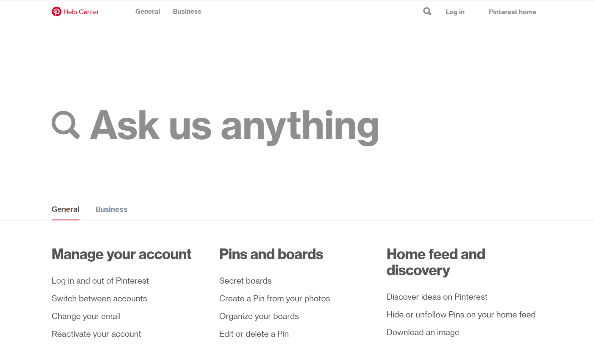
Pinterest takes the concept of simplicity to a whole new level. They’re very keen that you use their search bar (which is excellent).
One awesome feature is the separate tabs for ‘General’ and ‘Business’ which prevents users from getting bogged down in questions that are irrelevant for them.
4. Spotify

(Source)
By now, you’re probably getting the trend of having a search bar if you want to create the best possible FAQ page.
But Spotify goes one step further by linking its most popular FAQ articles directly beneath the search bar saving users the hassle of typing.

(Source)
With categorization on point, Spotify also makes extensive use of video tutorials.
Helping users see exactly how to perform functions like making a playlist and download music for offline listening.
5. WhatsApp
(Source)
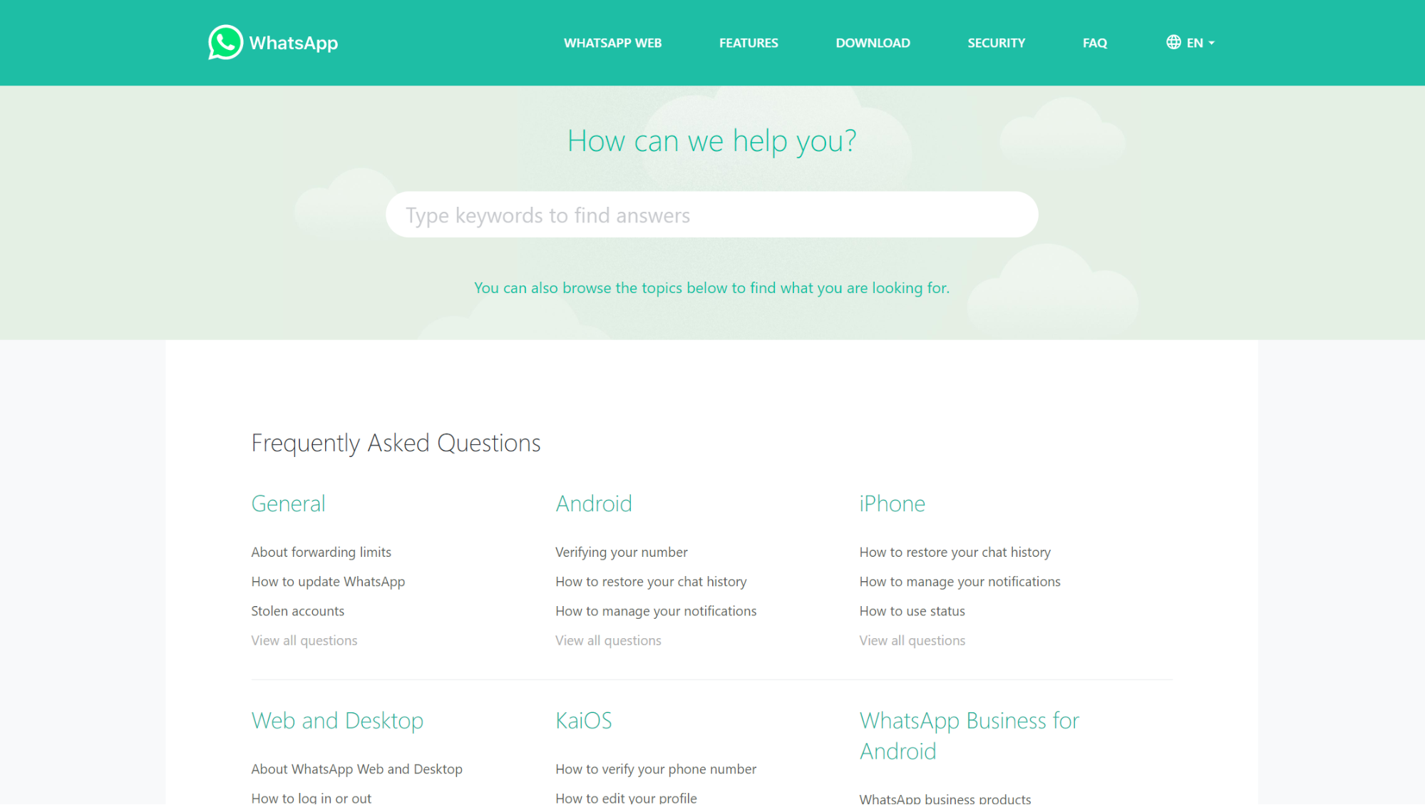
WhatsApp’s FAQ page design follows the philosophy of ‘less is more’. The simple no-frills layout does everything it’s supposed to: help users solve their problems.
By categorizing questions using broad categories like ‘Android’ and ‘iPhone’, you’re able to instantly narrow down your search.
Then by linking the top 3 questions in each section, navigating to the right solution is a piece of cake.
6. Nike
(Source)
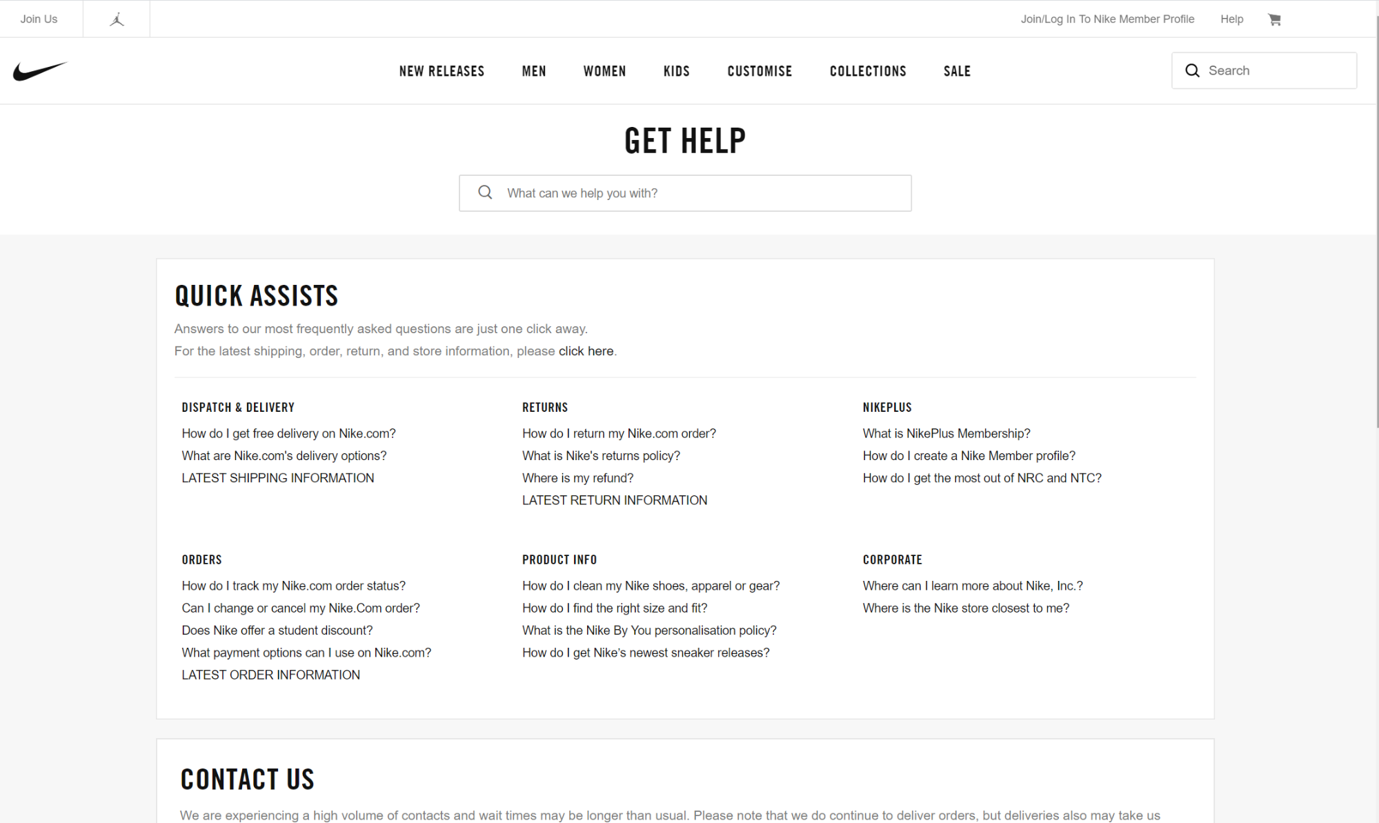
In a similar vein to WhatsApp, Nike has opted for a minimalist approach with its FAQ template.
At the top, they begin with a trusty search bar before breaking down their questions into ‘quick assists’ beneath.
Sports puns aside, we’d estimate that about 90% of visitors looking for help will find their answer on Nike’s optimized FAQ page in 2 clicks or less.
7. McDonald’s
(Source)
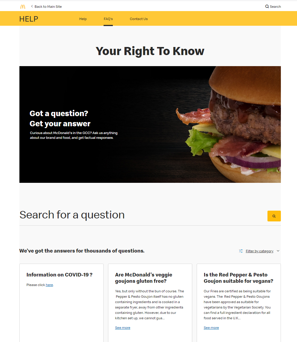
McDonald’s has done a stellar job of creating an aesthetically pleasing FAQ page.
You can search your question, filter by one or more categories, or simply browse articles by scrolling down.
They’re also leveraging the SEO aspect to claim snippets from this Google which is something you can do too:

8. Soundcloud
(Source)
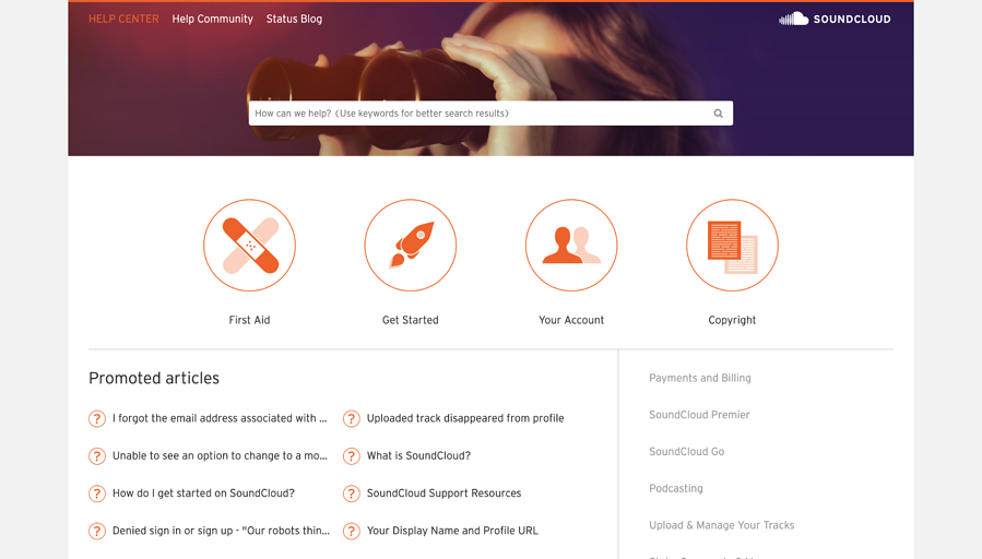
Ever searched an FAQ section and got no results? Pretty frustrating. Soundcloud has added a nice reminder to their search bar to ‘use keywords for better results.
This makes the page more accessible for people who mightn’t be used to using search engines.
With large icons sitting right beneath the search bar, a list of categories on the right-hand side, and their most popular articles, navigating their FAQ page is incredibly intuitive.
9. PrettyLittleThing
(Source)
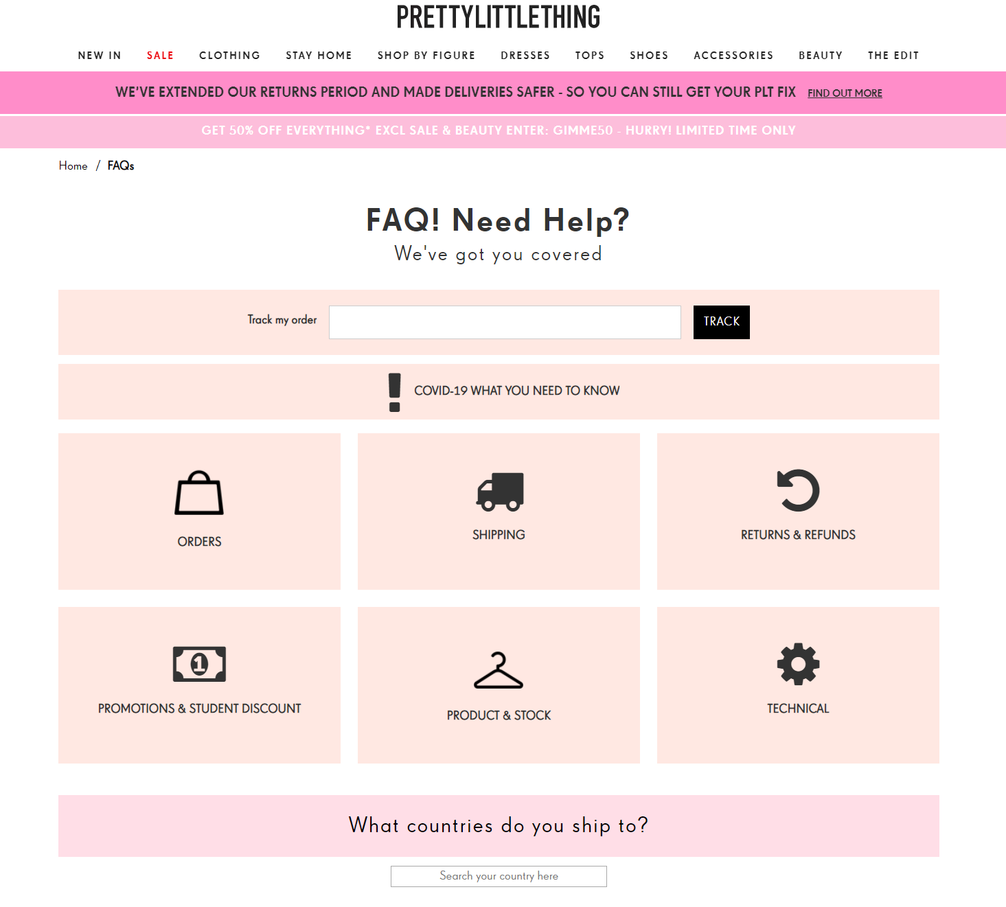
While we can’t condone the lack of a search bar, fashion retailer PrettyLittleThing has done an otherwise fantastic job designing their FAQ section.
Large icons and smart categorization make for a great user experience and they’ve nicely incorporated their brand colors (and tone of voice) without distracting visitors from the task at hand.
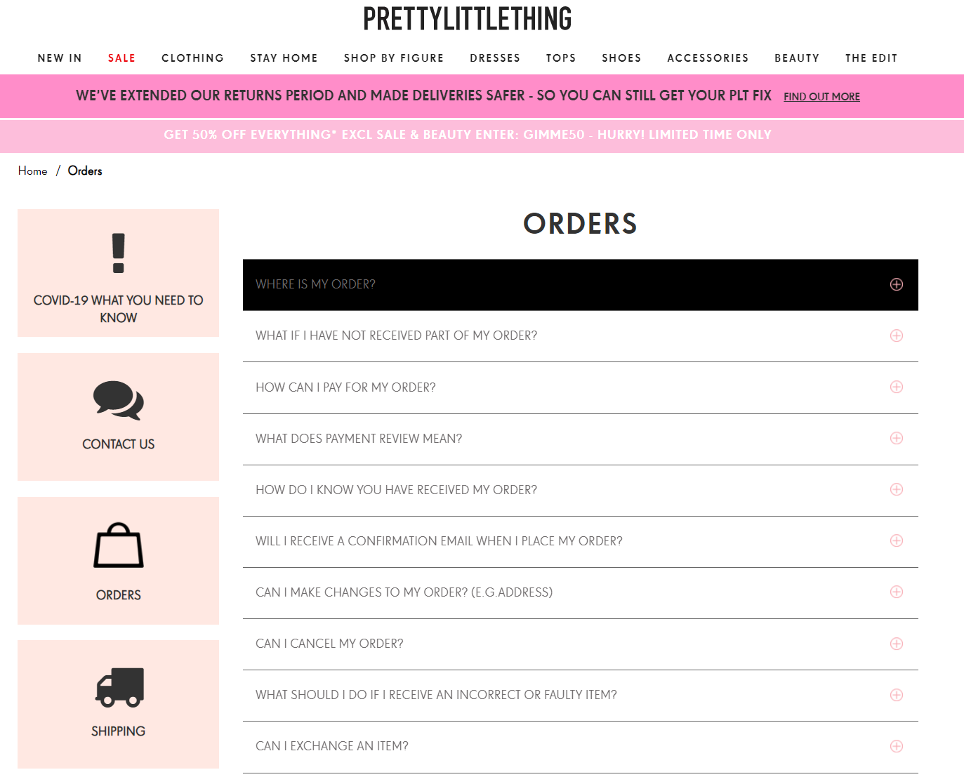
Their use of dropdown question boxes keeps things neat, while the navigation icons remain clickable no matter what section you’re in.
10. Buffer

(Source)
Buffer’s FAQ section is a perfect example of how you don’t need elaborate designs to create an effective FAQ page.
Their basic FAQ template (a search bar and a single grid of rectangular categories) is one of the most proven and user-friendly setups you can use. It ain’t flashy, but it works.
11. Hulu
(Source)
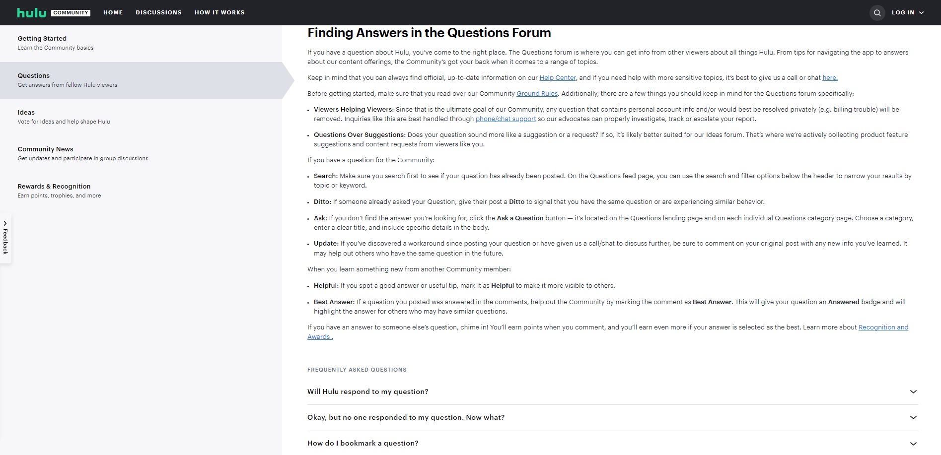
Hulu's FAQ page puts a unique spin on things by having both a static page that's created by the company as well as a dynamic component by making use of a community forum to help provide answers to members' frequently asked questions.
12. Center for Disease Control and Prevention (CDC)
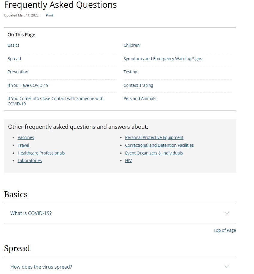
Looking at how to create a FAQ page that does its job?
Then look no further than the example FAQ page from the CDC.
Their page is broken down into sections, with each section having its own frequently asked questions. This makes navigating a breeze, allowing visitors to find the answers they want easily and quickly. Additionally, they include internal links to other FAQ pages that are related to the topic at hand.
Their page is also helpful in generating organic traffic as their questions rank near the top in Google's search engine as seen in the following screenshot.

Using a Knowledge Base to Create Your FAQ Page
At this point, you might be thinking “These are awesome FAQ sections, but my current website isn’t capable of producing such great designs”
Well, don’t worry. You don’t need to overhaul your entire site or hire an expensive developer. Instead, you can use a knowledge base to power your FAQ section.
Admittedly, we’re slightly biased in this regard, but using a customer service knowledge base gives you a number of super benefits over a traditional FAQ page.
For starters, knowledge base software lets you easily build FAQ-style pages without the need to wrangle with code. You’ll find organizing and categorizing your FAQs easier than ever.
Plus it’ll allow you to fully customize and brand your FAQ section too so your users instantly know where they are.
It also allows you to create and link to in-depth articles within your FAQ. Especially valuable for keeping your FAQ clutter-free if you’ve got a product that requires more complex answers.
You can even do cool things like troubleshooting multiple answers based on a user's interaction.
What’s more, quality knowledge base software equips you with the tools to analyze how users are interacting with your FAQ content. This is awesome because solid analytics is essential if you want to know how to adjust and improve.
Lastly, using knowledge base software will let you easily create a searchable database of answers. Allowing your users to find exactly what they’re looking for with ease.
So, if you’re sick of messing about with your current FAQ section and want to dip your toe into the uber-powerful world of knowledge-base-fueled FAQ then sign up for a two-week free trial today of our knowledge base software
In Summary
Having a great FAQ page can literally be the difference between a happy customer and a frustrated one.
Too many people relegate their FAQ page to a last-minute effort. Stashing it away in a dark corner of their site with a few meager details about opening hours and return policies.
That does nobody any favors.
Instead, when creating a great FAQ page think about:
- Including real FAQs that your customers actually ask you
- Keeping things simple & organized
- Making your FAQ page searchable
- Optimizing it for SEO
- Updating it every quarter
Treating your FAQ section like a valuable asset lets you educate your customers, instill trust in your prospects, and cut down on unnecessary support requests.
And if you’re looking to take your FAQ game to the next level, powering it with knowledge base software will give you a step up on your competition (Hint: Ours is awesome!)
With that said, there's nothing left to do but go forth and give your customers the answers they need. Good luck!
![How to Write User or Instruction Manual [With Examples]](https://static.helpjuice.com/helpjuice_production/uploads/upload/image/4752/direct/1660964116996-Instruction%20Manual.jpg)
![21 Best Customer Service Software Solutions [2025]](https://static.helpjuice.com/helpjuice_production/uploads/upload/image/4752/direct/1576238269667-1572446867619-Customer-Service-Software.jpg)
