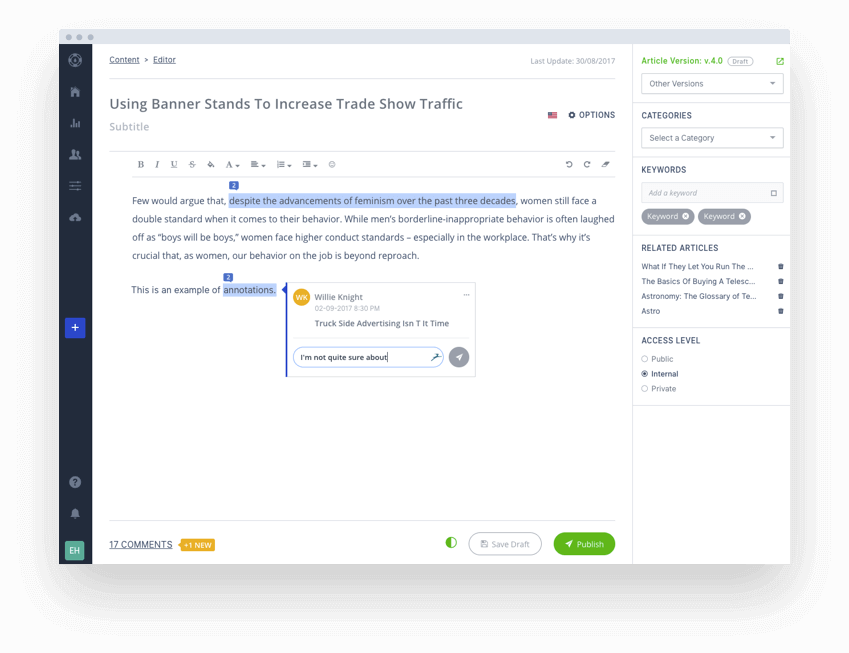
The key to writing great knowledge base articles is ensuring the content is clear, engaging, and informative for your end users.
The good news is that crafting awesome content for your knowledge base isn’t nearly as complicated as many people think.
With the right approach and a dash of know-how, you can author articles to improve your customer's and employee's experience with minimal stress.
In this article, we’ll run-through eight best practices for creating great help content as well as share several examples to inspire your own.
But wait, what if there is an easy way? You can either manually do all this or use a knowledge base software that does it all for you. Writes a knowledge base article and so much more with a few clicks following the best practices that we will cover in this article.
What is a knowledge base Article?
A knowledge base article is a written resource that provides clear answers to common questions, problems, or procedures related to a product, service, or topic. These articles aim to help users solve issues independently by offering step-by-step instructions, definitions, or troubleshooting guides.
Excellent Examples of Knowledge Base Articles
Okay, before you have an idea of how to write effective articles that will support your end-users, let's look at some great knowledge base examples from real companies to see how they are implementing these same practices.
Visual Overview of the HootSuite Dashboard (@Hootsuite)
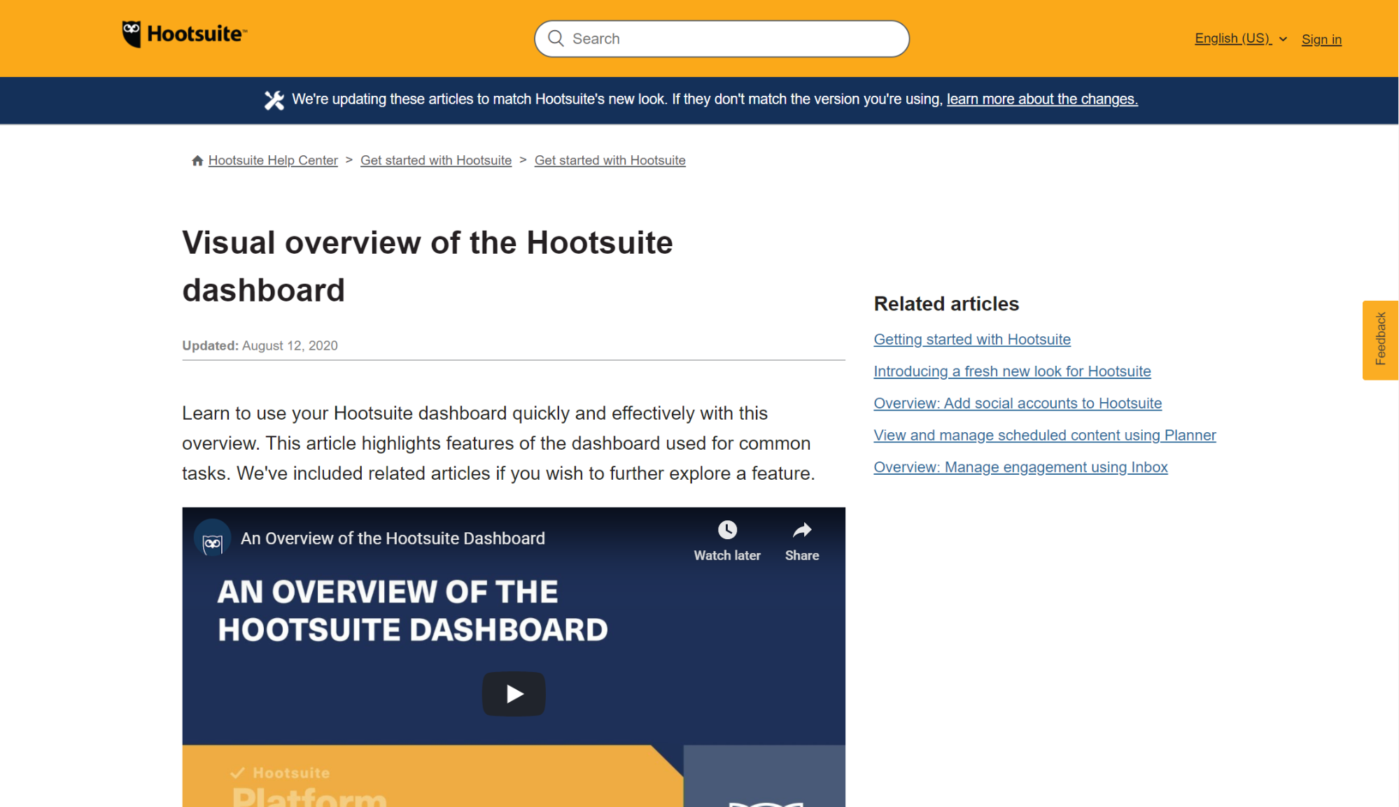
Hootsuite’s guide on how to use their dashboard is a perfect example of how to ace a knowledge base article. A short introduction leads into a video overview of the topic which is supported by a well-thought-out article beneath. Complete with screenshots and handy links for more information makes learning the dashboard features a breeze.
McAfee WebAdvisor Blocking RMS Reports (@RMS Cloud)
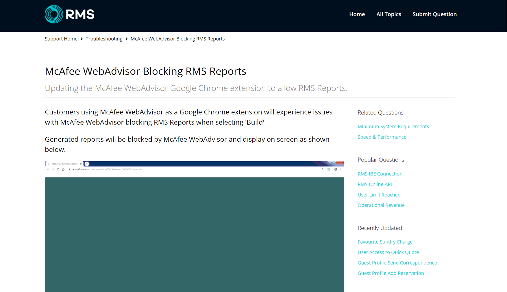
RMS has created a fantastic page on how to stop McAfee from blocking RMS reports. Notice the skimmable layout, clear step-by-step instructions, large text, and handy visual guide at the end. And does it work? Well, with lots of articles like this, RMS cloud has been able to resolve 50-75% of their day to day support requests via their knowledge base.
Conversion Tracking for Websites (@Twitter)
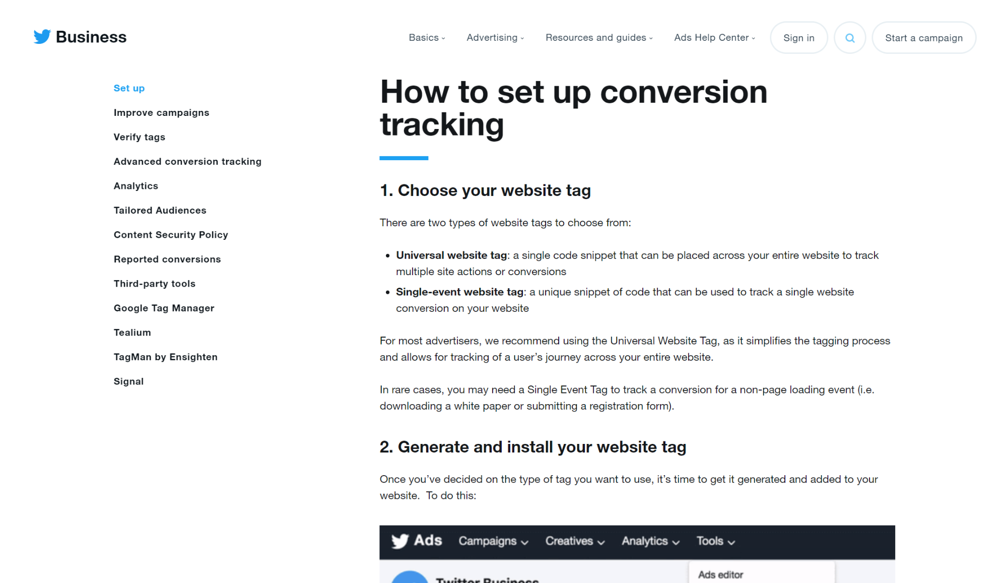
Twitter’s monster article on how to set up conversion tracking is a great example of how to structure longer-form content. The spacing, use of headings, annotated screenshots and ever-present navigation mean users can quickly locate, extract, and implement the knowledge they came for.
How to Preview & Compare Courses (@Udemy)
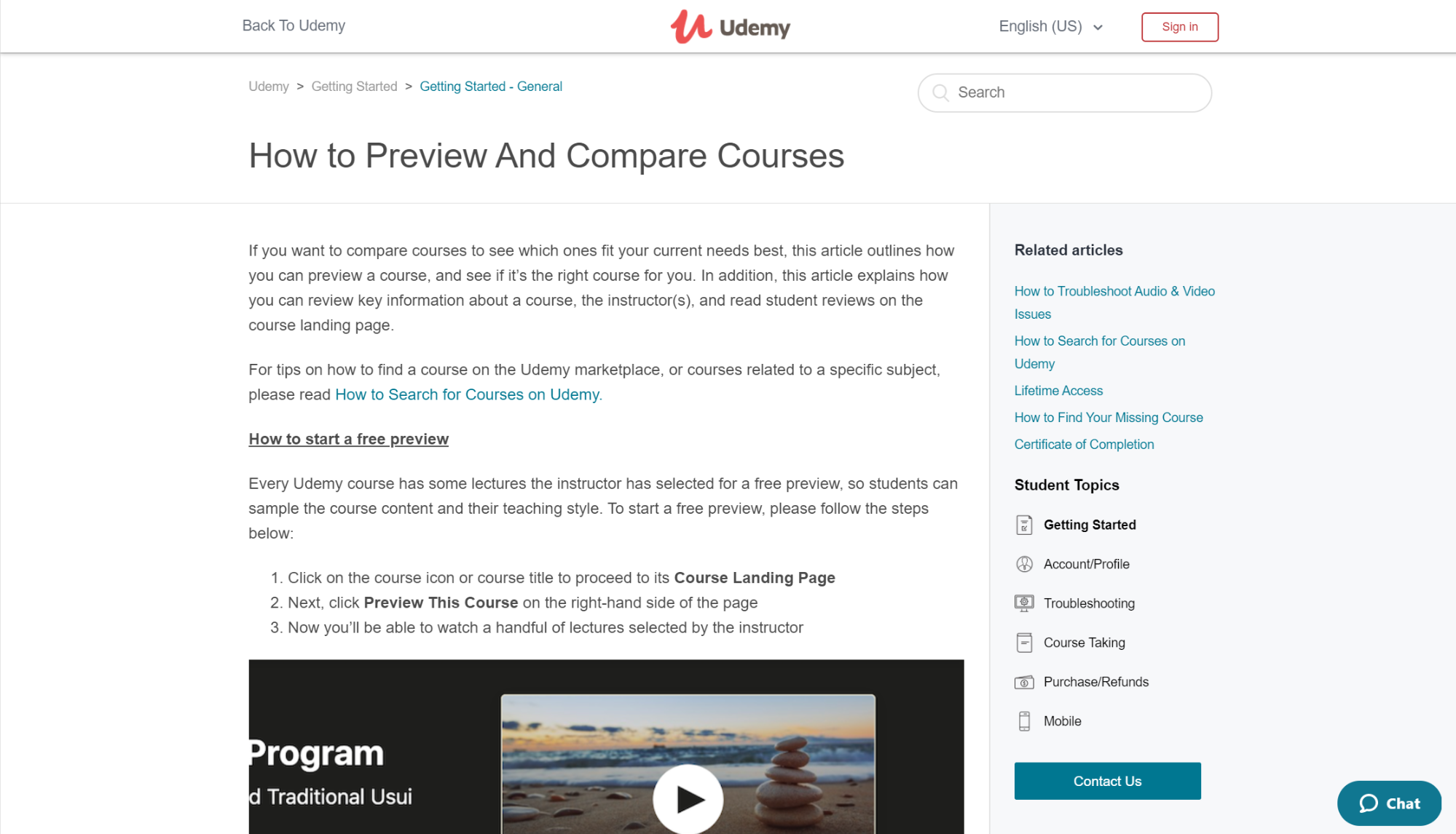
The shortest article on the list, but no less impressive, is Udemy’s piece on how to compare and preview courses. It’s simple, to the point, and teaches exactly what its title says. A welcome reminder of the need to keep things concise.
How to Navigate Estimate Rocket (@Estimate Rocket)
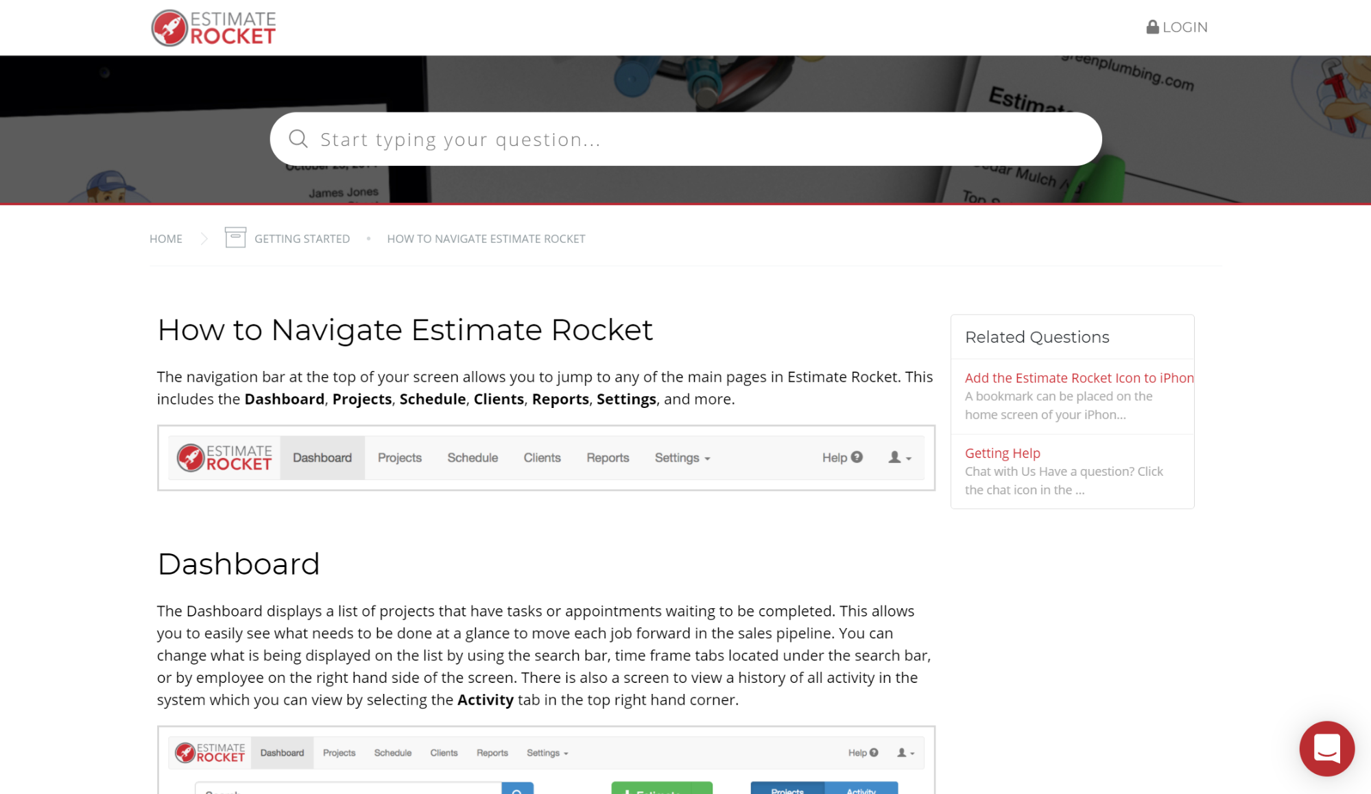
Estimate Rocket breaks down exactly how to navigate its SaaS tool in this brilliant article. Each panel is dissected and explained in plain language with the help of a screenshot so users know exactly what’s being said. The writing is clear and concise, the headings are well spaced out and there’s a link to contact live support in case you didn’t get the answer you were looking for.
Setting Up Your Online Store (@Shopify)
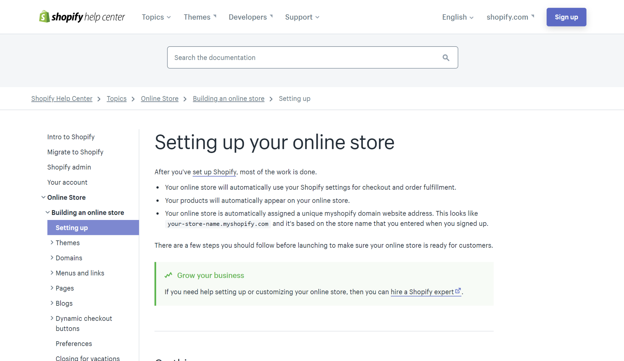
It’s bullet-points galore in Shopify’s ‘setting up your online store’ article which makes getting started with their platform a walk in the park. The use of bolding alongside clear headings is particularly effective to help you skim through the article. And if that wasn’t enough, they included anchor links at the top for maximum efficiency.
How to Make A Collage (@Collage)
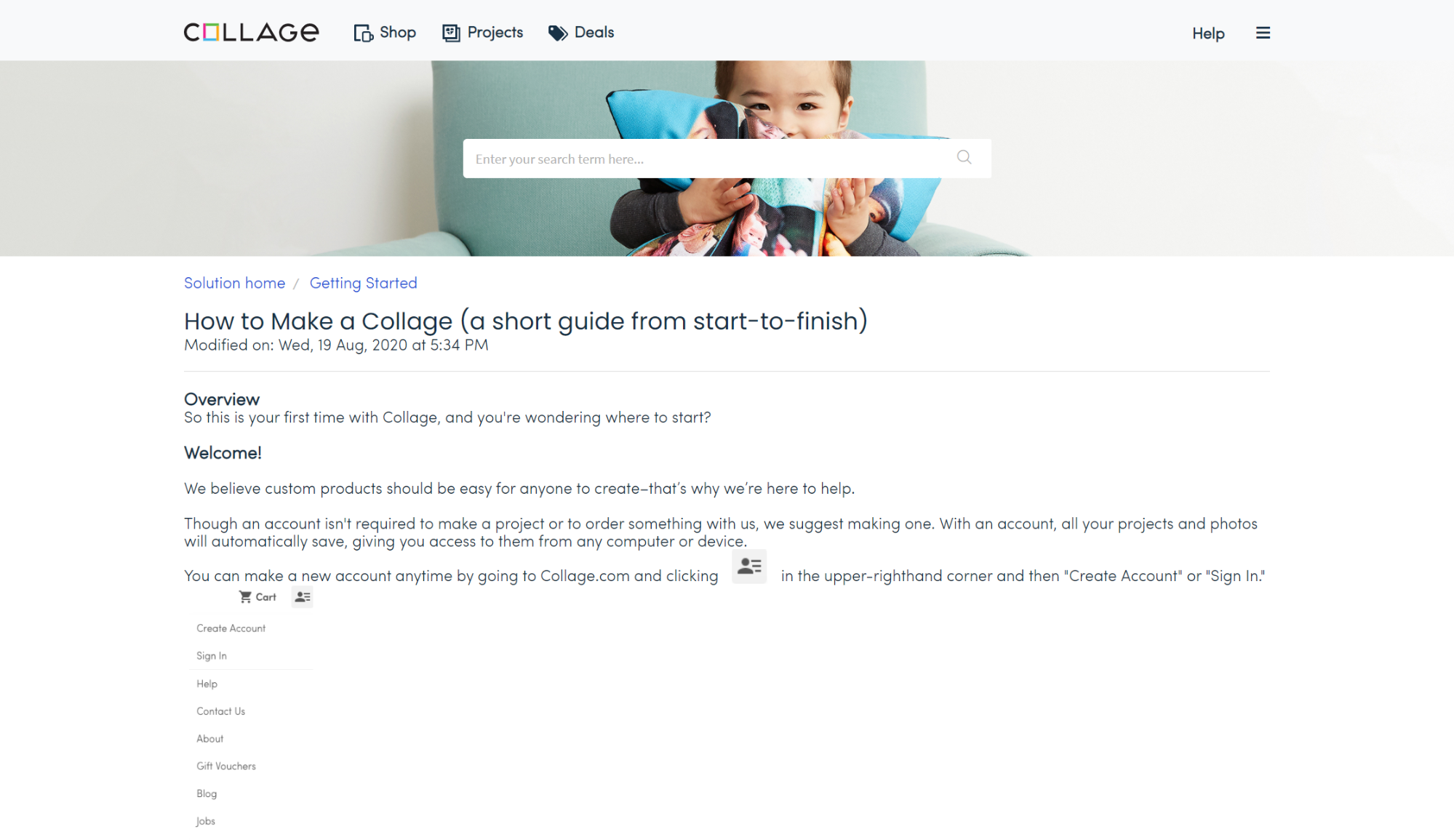
Ecommerce company Collage makes it dead easy for their customers to create their own personalized photo collage with this awesome page. It’s a great example of how you don’t need to go overboard with fancy graphics or complicated design. Sometimes it’s better to pair things back and let your help content do what it does best.
What Makes a Knowledge Base Effective?
1) Purpose
A knowledge base exists to help people solve problems on their own—without waiting for someone to reply. That usually means:
- Reducing repetitive questions (and lowering support ticket volume)
- Speeding up onboarding and training for new hires
- Creating a single source of truth so teams don’t rely on tribal knowledge
- Closing knowledge gaps across departments (support, sales, ops, engineering)
- Improving consistency in how tasks are done and how answers are given
2) Content
A strong knowledge base is made up of practical, searchable answers, typically including:
- FAQs for quick questions (billing, access, policies, limits)
- How-to guides for step-by-step tasks (setup, workflows, processes)
- Concept explanations that clarify “what it is” and “why it matters”
- Troubleshooting for common issues (error messages, integrations, fixes)
- Policies + standards (security, refunds, approvals, documentation rules)
- Templates + examples (SOPs, email templates, onboarding checklists)
3) Format
Most knowledge bases are web-based and search-first, designed for skimming. Common formatting patterns include:
- Search bar + categories (so users can browse or search)
- Short paragraphs and scannable sections
- Bulleted lists for options and requirements
- Numbered steps for procedures
- Bold text for critical warnings, settings, or outcomes
- Visuals like screenshots, GIFs, short videos, diagrams
- Optional: tables (limits, permissions, comparisons), callouts (notes/warnings)
The goal is simple: help the reader find the answer in seconds, not minutes.
4) Structure
Great articles are tight, single-topic, and obvious from the title. They usually have:
- A descriptive title that matches what someone would search
- A direct answer near the top (especially for FAQs/concepts)
- Clear headings that guide scanning
- One primary intent per article (don’t mix unrelated tasks)
- A short “Next steps” or related articles section to prevent dead ends
5) Location
A knowledge base should live in one central, reliable place so everyone knows where to go, such as:
- A Help Center / Support Portal (customer-facing)
- An internal team wiki or intranet (employee-facing)
- A dedicated documentation site with structured navigation
- Sometimes embedded inside the product (in-app help), but still backed by one source
The key is centralization + easy access, so people don’t hunt through Slack threads, emails, or outdated PDFs.
Common Types of Knowledge Base Articles
1) How-to Guides
Purpose: Teach someone how to complete a task from start to finish.
Best for: New hires, repeatable workflows, tool setup, internal processes, product usage.
What it usually includes:
- Clear goal (“By the end, you’ll be able to…”)
- Prerequisites (access, permissions, tools, data needed)
- Numbered steps in the exact order
- Screenshots/examples (when relevant)
- Expected outcome (“You should now see…”)
- Next steps + related links
Example titles:
- “How to Create a New Client Project in Asana”
- “How to Reset a User Password in Okta”
- “How to Publish a Knowledge Base Article”
2) Troubleshooting Guides
Purpose: Help users identify why something isn’t working and fix it quickly.
Best for: Common errors, bugs, integrations, login issues, broken workflows.
What it usually includes:
- Symptoms (what the user sees)
- Likely causes (top 3–5 reasons it happens)
- Quick checks first (simple fixes before deep ones)
- Decision paths (“If X, do Y”)
- Error messages + what they mean
- Escalation info (when to contact support + what to include)
Example titles:
- “Troubleshooting: SSO Login Fails With ‘Invalid Assertion’”
- “Fix: Reports Not Loading in Chrome”
- “Why My API Request Returns 401 Unauthorized”
3) FAQs (Frequently Asked Questions)
Purpose: Provide fast, direct answers to common questions—minimal reading.
Best for: Pricing, access, permissions, policies, basic product usage, “what is” questions.
What it usually includes:
- Short question as the heading
- 1–3 sentence direct answer
- Optional quick steps or a link for deeper detail
- Variations of the question (people search differently)
Example titles:
- “FAQ: How Do I Add a New Team Member?”
- “FAQ: Can I Export My Data?”
- “FAQ: What’s the Difference Between Admin and Editor?”
4) Informational Articles / Concept Explanations
Purpose: Explain a topic so the reader understands the “why” and “how it works.”
Best for: Onboarding, policies, systems, internal standards, complex features.
What it usually includes:
- Simple definition up top
- Why it matters (impact on work, users, security, etc.)
- Key concepts/terms
- How it works (plain-language overview)
- Examples and “common misunderstandings”
- Links to related how-tos and policies
Example titles:
- “What Is an Internal Knowledge Base?”
- “Understanding Role-Based Access Control (RBAC)”
- “How Our Escalation Process Works”
How to Write Effective Knowledge Base Articles
When you boil it down, the difference between ineffective help content and brilliant help content is this: Brilliant help-content empowers users to accomplish whatever they set out to do.
The following 8 steps will ensure your knowledge base content helps users get the job done:
- Understand user pain points
- Assume reader's know nothing
- Make it easy to skim
- Keep it succinct
- Write plain titles
- Hone your voice
- Internally link
- Test and improve processes
1. Understand User Pain Points
There’s nothing more essential for writing great knowledge base content than understanding why your users are looking for help in the first place. Because figuring out what questions your customers are asking and identifying common themes directs you to create the most relevant content.
The good thing here is that most business owners already have a decent idea about where their users are getting stuck. But if you’re not sure, have a rummage in these 4 places:
- Ticketing system: Support calls, chats, and emails can be a rich source of customer frustrations.
- Support agents: They have valuable insight into customer pain points - make a list of the most frequent customer complaints they deal with.
- Social media: Customers frequently go to social media for help or to express their dissatisfaction - review your messages, mentions, and hashtags.
- Community forums: Check out what users are asking each other and where they’re running into difficulties.
Assume Reader’s Know Nothing
One of the worst things that can happen in a knowledge base is that your writing confuses your reader by talking about things they don’t understand.
To avoid this, assume your readers know zilch. Compose your articles as if you were communicating with an absolute beginner.
You don’t need to dumb things down per se - think more along the lines of swapping out technical jargon and explaining difficult concepts in simple language.
For example, before explaining how customers can get started segmenting their email lists, the marketing automation platform Mailchimp defines several key terms new users might not be familiar with.
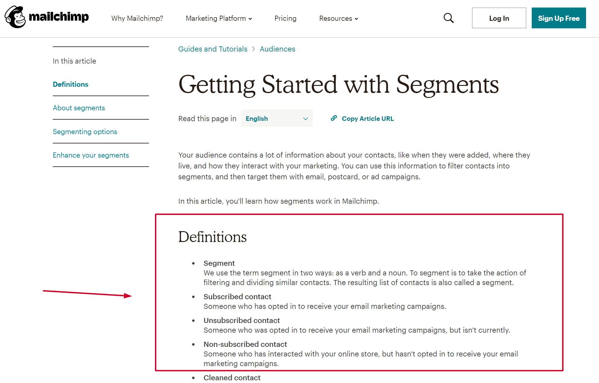
Bringing readers up to speed like this ensures that they won’t get lost further down the line when more complex problems are introduced.
Another habit that'll torpedo your articles is mentioning ‘how-tos’ in passing. For example, let’s suppose a reader wants to edit their photos using a piece of software
Which of these would be a more helpful solution?
- After connecting your camera, import your photos
- After connecting your camera, click Menu > File > Add Photos > Import > Import all
Number one assumes the reader is already familiar with how to import photos. Number two, on the other hand, works for both those who know and those who don’t know how to complete the task.
The takeaway? Make zero assumptions about what the reader knows - no matter how straightforward the task or concept may be. More advanced users will simply hop over basic details, but less experienced users will run into mountains of difficulty if they’re missing.
2. Make it Easy to Skim
Making no assumptions about what the reader knows means some of your articles may end up being quite lengthy. And that’s not necessarily a bad thing.
But with a majority of customers expecting online help within 10 minutes when they have a marketing or sales-related question or a customer support issue, you want to make it as easy as possible for people to find what they need.
That's why, for long-form knowledge base articles, the key is to organize them with appropriate headings, subheadings, and bullet points, so as to allow users to quickly skim and locate the information they need.
For example, look at how Shipt splits up longer-form content to make it more digestible. When initially visiting their knowledge base, you're presented with several popular topics as well as frequently asked questions.
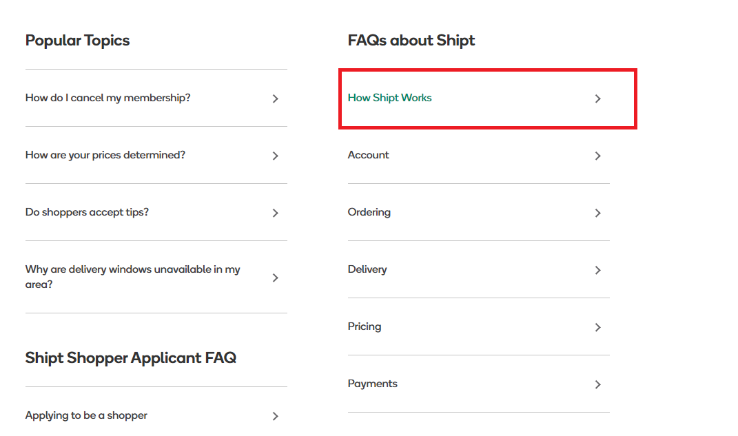
When clicking on one of these FAQs, you're brought to a separate page that's further broken down into subtopics as seen in the screenshot below.
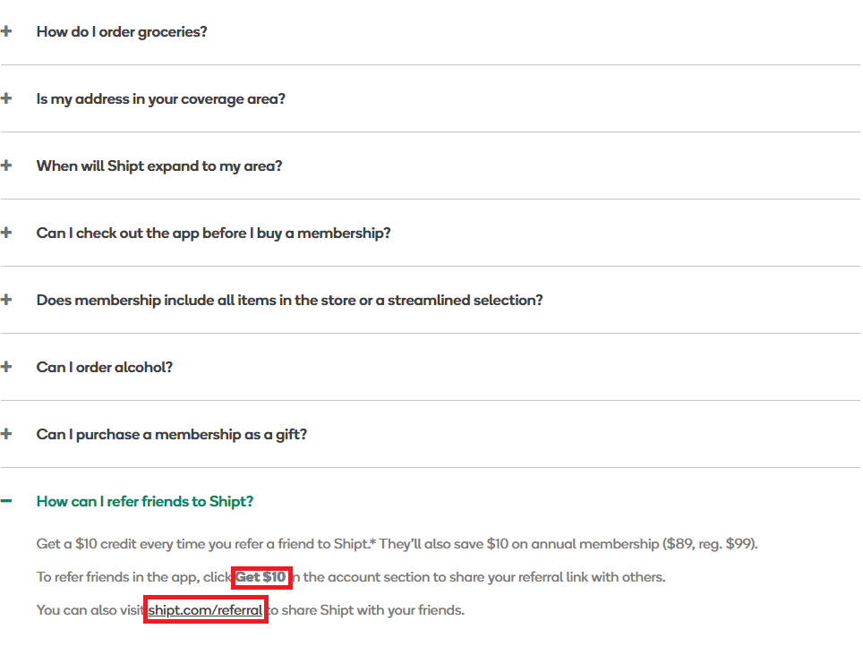
By making use of a variety of headings, spacings, bolded text, and bullet points, the information instantly becomes more approachable.
To do this in your articles:
- Start by writing out all the ideas you’re going to include
- Bundle related ideas together under common headings
- Order headings in a way that makes logical sense
- Write your paragraphs under each heading with no more than 2-3 sentences per paragraph
Once you’ve got a solid structure in place, it’s also wise to add a table of contents with anchor links to allow users to navigate directly to the section they need. This is especially handy for more advanced folk who might want to skip the entry-level stuff.
For example, Zoominfo does an awesome job of making it easy for users to navigate to the relevant section without the need to scroll up and down the page.
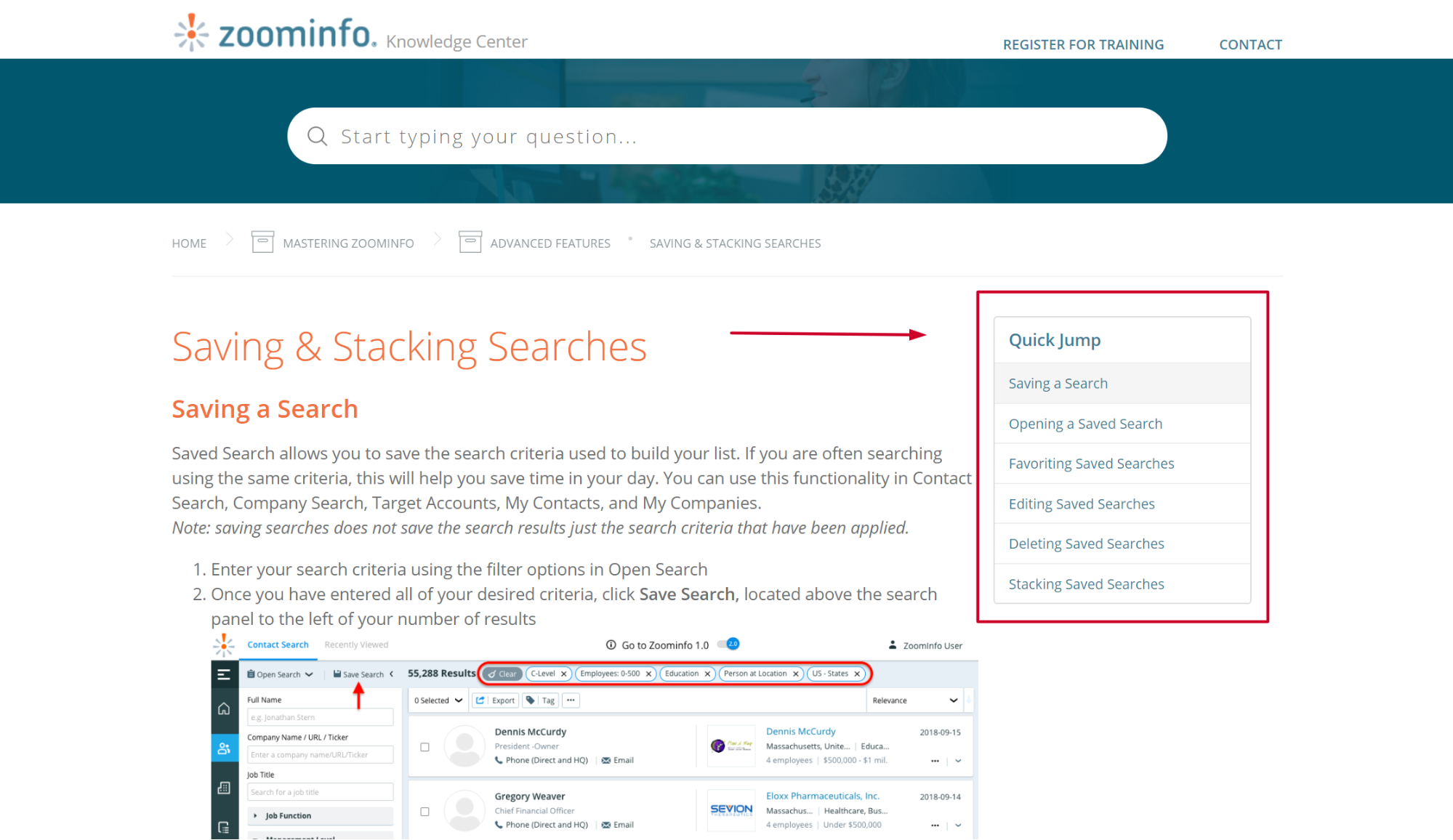
In short, structuring your articles for skimming increases your KB’s usability, helps users better understand your message, and ultimately resolve their problems faster.
3. Keep It Succinct
With all this talk about extended articles, it’s important to remember that length is not the goal here, it’s simply an occasional side effect of creating comprehensive guides. The truth is that the more concise you can make your article, the better. Hence, you should review and summarize content before publishing to ensure your message remains clear and impactful without unnecessary length.
Think about it: if your customer is trying to get themselves out of a jam, they don’t want to sift through mountains of superfluous information. Instead, they want the relevant knowledge they need to solve their problem, and not one word more.
That means you must become a ruthless editor. Strive to eliminate unnecessary information that doesn’t add to the issue at hand. Shorten your intros. Chop wordy paragraphs down to size. As a rule of thumb, if you’re unsure if something is relevant or not, it probably isn’t.
Where appropriate, make use of media for greater clarity too. Screenshots & GIFs can go a long way to helping users absorb information more quickly when deployed alongside text. Giphy Capture is a useful tool to help accomplish this.
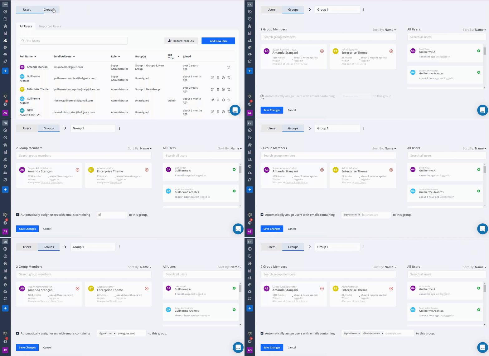
However, be careful using video for solving problems or errors. While videos are good for general overviews and introductions - they’re not as capable of zeroing in on the specifics that your customer is looking for. People in a rush will be forced to watch an entire video to get the one nugget of wisdom they need.
If you do use video, make sure to timestamp it. Plus, include a text version alongside to make it more efficient and consumable for your time-starved users. Remember, keeping things to the point is the name of the game.

4. Write Plain Titles
Knowledge bases aren’t blogs, so there’s no need to try and hook the reader’s attention. Users are already looking for your help anyway.
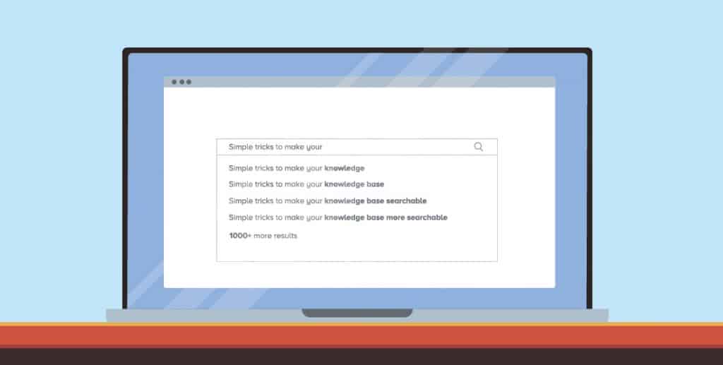
Instead, craft simple titles that convey what problem your article addresses. Ask the question: “What would my users search for when looking for this information?” and when answering aim for clarity over creativity.
Keep in mind that people typically search using basic keywords - “how to insert images and videos becomes ‘insert images and videos” - so model your titles around the keyword phrases.
Using active verbs is a good strategy for kicking off the title of your articles. Some examples are:
- “How to…”
- “Launching…”
- “Setting up…”
- “Using…”
- “Creating…”
- “Getting started…”
Alternatively, you can simply state what topic the article is about for example, “Overview: Article Templates”. As long as it’s crystal clear what your article is about, you can’t go too far wrong.
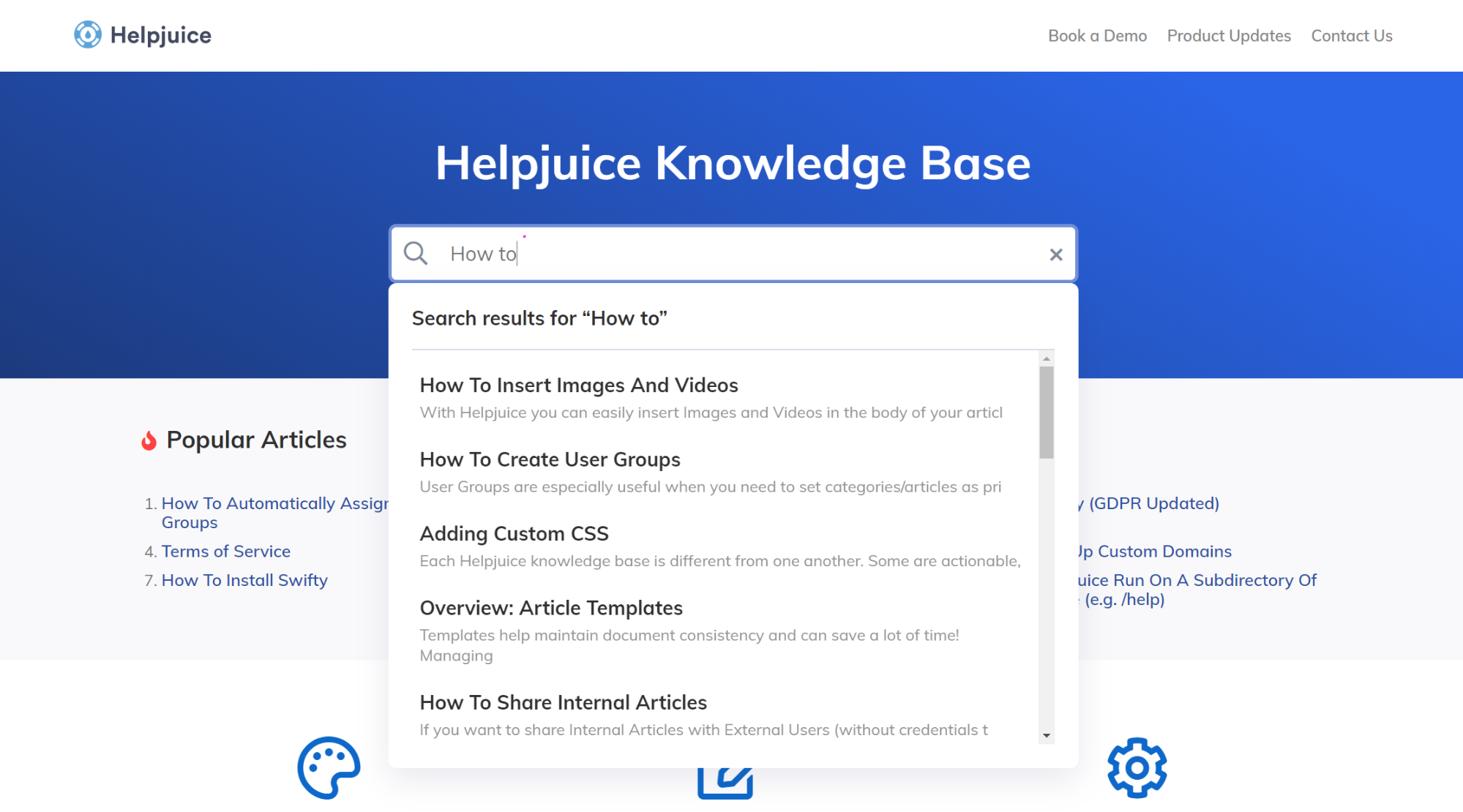
As you can see from our knowledge base - none of the titles on display are flashy. Instead, they’re clear cut - just the way they should be.
5. Hone Your Voice
As linguist Steven Pinker points out in his book ‘The Sense of Style’, smart folks often shun simplicity in an attempt to prove their intelligence. However, as Pinker reveals, using flowery language only makes others think they’re poor communicators.
And your knowledge base is the exact same. People won’t be impressed by your high command of the written word if it’s distracting them from getting what they came for.
So, here’s 7 tips to keep your knowledge base article on point:
- Put your faith in plain language
- Use the active voice
- Use common, familiar words
- Use a single term for each concept across all your articles
- Write as though you’re talking to just one person (ideally, your buyer persona)
- Avoid humor when troubleshooting errors (a little humor is fine for non-troubleshooting articles)
- Keep it to the point - spreading ideas over too many words will lose your reader
- Always keep your reader’s goals at the top of your mind
The ultimate goal is to make your writing engaging, but without allowing your message to become lost amongst a sea of ‘brand personality’ or unnecessarily complex language.
Two tools that can whip your copy into shape are Grammarly (awesome for spell checking and finding better phrasings) and the Hemmingway Editor which will make your writing bold and clear.
6. Link to Related Content
Linking to related content allows you to take the pressure off having to cram too much information into one article while still ensuring that users are easily able to self serve themselves. 
The important thing with linking is that you do in a way that doesn’t distract the reader. We don’t want to pull their attention all over the place before they’ve internalized what we're trying to say.
So don’t link to every article that’s remotely related to the topic at hand. Instead, use links only when they’ll nudge users towards the next logical piece of content.
(Note: As we'll discuss in the next step, you'll be able to figure out the logical pieces by analyzing data from your knowledge base analytics as well as collecting feedback from your support agents.)
7. Constantly Improve Your Process
The perfect knowledge base doesn’t exist. All great knowledge bases became that way precisely because they committed to the continuous improvement of their content.
How do they do it? Through data and feedback.
A good knowledge base solution will provide analytics that let you discover things like:
- How your content is performing over time
- What topics users are searching for
- What topics people are consuming most
- Which articles need to be improved
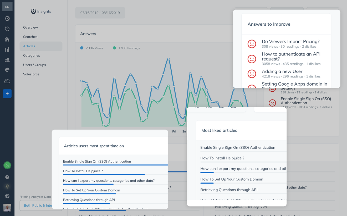
Using such information, you can double down on what’s working and ease up on what’s not. Over time, you’ll build a powerful collection of articles that your audience will thank you for.
It’s worth mentioning that the benefits of analytics go beyond just improving your articles. Support data is a great source of insight into how customers are thinking and feeling. That means it can also help you build a better product, refine your sales process, or inform your marketing strategy too.
Just think about it: if lots of users are searching for “how do I integrate with (insert tool)” you can feed that information back into your dev teams and build a solution that your customers want.
That means that while your writing is giving users a better experience, how they’re interacting with your content is giving your business valuable feedback about how to improve. Talk about a win-win.
Wrapping Up
Writing good knowledge base articles can be a challenge at first. But with practice and a little elbow grease, you’ll soon be whipping up articles that your customers adore.
Start with the easy stuff. Begin writing just a few articles on uncomplicated topics. As you grow in confidence and skills, you’ll be better equipped to tackle complex articles without pulling your hair out.
Like Rome, no great knowledge base was built in a day. So don’t try and rush things. Instead, approach your article writing one step at a time. Focus on quality, stay organized, stay consistent, and stay patient.
Trust the process and you’ll reap rewards sooner than you think.

![How to Write an Effective FAQs Page [With Examples]](https://static.helpjuice.com/helpjuice_production/uploads/upload/image/4752/direct/1709664714926-1709664714926.png)

.png)
