One of the first questions I had when I started working for HelpJuice was: What exactly are the best design practices of a knowledge base that just makes it so GOOD? Why do some KB’s appeal to me while others make me want to raise a cross and beg them in Jesus’ name to disappear?
The UX-principles I came up with (through HUNDREDS of hours of research and conversations with the team) were not only good on their own but easily replicated as well.
There were many ideas written down but I broke them up into 4 core ones when it comes to managing knowledge bases that have helped us and our customers prevent up to 50% in support e-mails.
1) The Bigger The Search Box – The Better The Results (How Does +36% Sound?)
We tested out the difference between a smaller and less prominent search bar versus a bigger and more attention-craving one. The results? It was up to 36% more effective! With a bigger box, there will be more people searching. With more people searching, the more they’ll be using your knowledge base solution.
And with the assumption that your knowledge base doesn’t completely SUCK, this will result in fewer support e-mails.
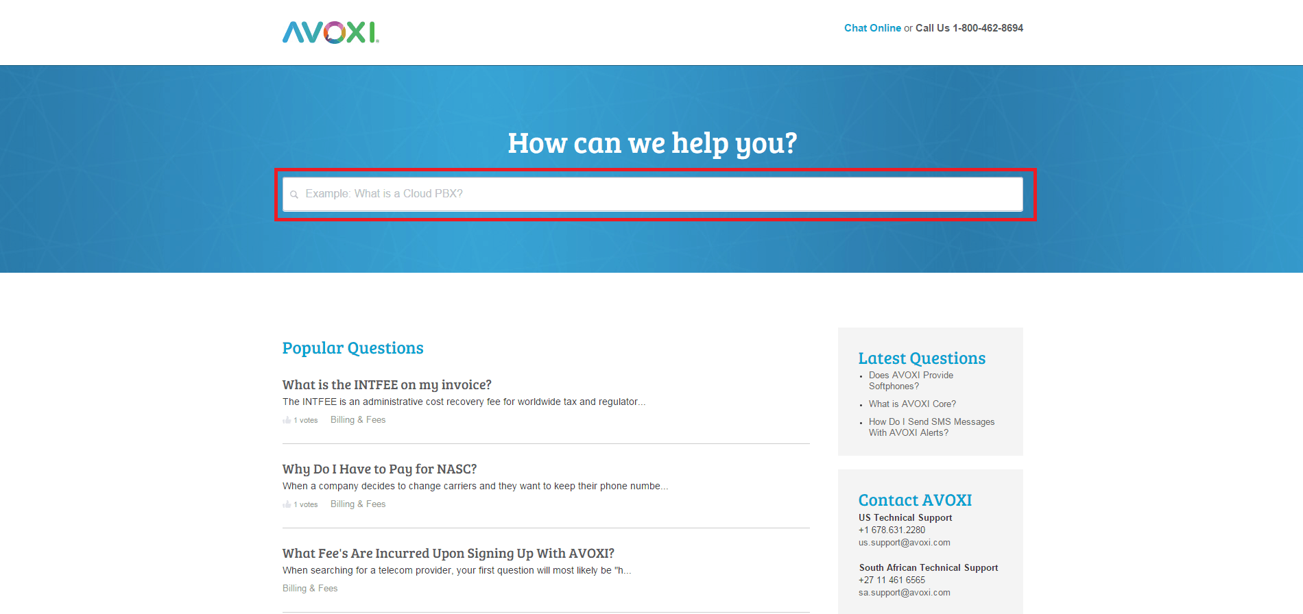
Think BIG. I mean, look at AVOXI’s search bar in their knowledge base. It’s designed so darn huge that you can literally see it 6 feet away from your computer screen!

So if you’re looking to create a user-friendly knowledge base of the best kind – implementing a big fat search button is the #1 step!
2) 80% Of Your Visits Might Be Looking For 20% Of Your Articles.
Now, we’re all familiar with the 80/20 rule, but let’s see how we can manipulate it in a way that can save you 5-10% in support just by knowing where to place your best content on the page.
This might work if you have less than 50 articles. As we’ve found a lot of times, you usually get the same 5-10 questions over and over. Hence, if you optimize for this, you can write knowledge base articles that answer a customer’s most frequent questions without them having to even search for it.
Here’s what I mean:

Let’s say that you have a 50% success rate in your knowledge base, where half the people that read your top 10 articles never end up sending you an e-mail or ticket. In theory, if most your folks are going to these articles, it makes would make sense to adapt your design around it, as it might help you reduce support!
So, imagine if we just increased the traffic to these articles by 10% of whatever they were previously getting.
Look at what would happen, if you factor in that those X articles have a ‘success rate’ of 50%:

Now, gaining traffic aimed specifically at those top 10 articles would be ideal – but how do you do it?
The solution is simple: You serve it right in front of them on a silver platter. For example, what is the first thing you see on Wealthbox’s knowledge base as soon as you enter the site? Except for the ginormous search button, you also see:

It’s not a silver platter exactly, but it does the job perfectly. The reason it works is because it might spare you from even using the search bar at all. As a regular customer, you’ll probably look at this and go “Well, no need to call, send a ticket or e-mail anyone”. As a business owner, you go “Dinner is served!”
So pick out the ten most popular articles from your content and place it right under the nose of the search bar. It will increase your traffic significantly and you theoretically have a high chance of saving over 10% in support!
3) Article Recipe: Smooth, Simple, and Actionable.
If everything around your knowledge base is designed to be easy on the eyes – so should your articles too. Being the core of the very knowledge you’re providing the users – the articles must flow just as smoothly as everything else.
Intercom understands the concept of beautifully written and actionable articles.

By using a simple navigation bar customized for each section of the article, the customer can choose to either read the whole thing or click on a specific area he wants to read about. This reduces the risk of users closing the website now that the nav-bar is relatable to them!
In addition, they have a video in the very beginning of the article explaining everything you need to know in 1:55 minutes. ‘Reading’ has now been downgraded to merely an option – not a necessity.

Now look at the paragraphs themselves. This article is so easy to read you can practically scan through it without reading and still get all the information you wanted.
The tricks behind it?
- Keeping it short.The paragraphs are very short and straight to the point. There isn’t any lingering or off-topic sentences that slow the reader down. You get what you came there for.
- Images.It allows you to rest your eyes as you are scrolling down the page and reading the content. It doesn’t bore you.
- ‘Universal’ relevance.It doesn’t matter who you are; novice, mediocre or advanced – the articles will always relate to mostly anybody clicking on it.
These things will reduce the chance of the user closing the tab out of frustration or deciding to call you or send an e-mail instead.
Implement something similar, and you’ll notice your customers slowly turning invisible on your mailing list
4) Newbies, Power Users, and Evangelists Shouldn’t See the Same KB Content
Just like you have newbies, power users, and evangelists, you should tailor your KB around them. This means, a newbie probably doesn’t need to see your super advanced content just yet.
We’ll categorize users as either A, B or C class to show how information can be segmented to them differently.
How Mercedes Uses The Same Idea
A friend of mine bought an AMG recently and was telling me about how Mercedes markets their cars based on the customer buying it. I raised an eyebrow when I noticed it works in similar ways as the A, B and C categorization.
 We can categorize this first example as A-Class. The standard Benz is a $30,000 car that has plenty of competition and isn’t really any ‘different’ from most other cars.
This probably requires as much information as possible to be given to the customer so that he knows why he should pick the Benz over a BMW, for example.

The AMG is faster, stronger and slightly more premium. This car is not something that any “regular” customer buys, but rather a customer that already knows a thing or two about the Mercedes brand and wants to move up a notch in quality.
Would this customer need the basic information that the previous customer got? Probably not. The information given to the AMG consumer will probably be less and therefore we can categorize this customer as B-class.

Finally, the all exclusive and VIP consumer who wants to go for the best of the best. You know what you are getting and if the salesman started telling you the basics of a Mercedes at this point – you’d get offended and feel as if he’s you’re stupid. So at last, we’ve reached the C-class customer.
Notice the pattern? The more we’re going towards the ‘exclusive’ buyers of Mercedes products, the less novice information’ is needed for that particular user.
For example at HelpJuice we’ve optimized our KB to display relevant content to you, based on the number of questions and log ins you’ve made.
So find out who your users are and how much information is really needed to be shared with them – and start slicing your content down like a soft loaf of bread until only a sufficient amount of bread pieces are left to still their hunger.
Quick Summary
From optimizing the search box, implementing the 80/20 Rule to writing smooth and actionable content and knowing how to segment it – you’ve successfully practiced a knowledge base that’s designed easy on the eyes and almost guarantees users to read, enjoy and implement everything they need to get their question answered.
We highly recommend implementing these ideas as we’ve found that, from the thousands of KBs we’ve seen go through HelpJuice, really successful ones have at least one of these UX traits!
PS: What are your thoughts? What have you found to be a good UX practice in a KB/Help Center?
