The customer onboarding process is a critical part of the overall customer experience, for both the provider and the user. After all, onboarding is all about educating your trial users on how to use your product and converting them into power users. Having a poor user onboarding experience will leave new users confused, and won’t enable them to get much value out of the tool in question. Chances are, they won’t stick with your brand for much longer — and they’ll likely defect to a competing brand, to boot.
As Aaron Krall, a SaaS Onboarding and Growth Hacking expert, says, customer onboarding is like drug dealing. Your mission is to make your users addicted to your product.

The key to converting a first-time customer into a power customer is based on the following three essential parts:

- The “Aha” moment - the moment when your users perceive the value of your product/feature - but still don’t taste it.
- Activation point - this is the moment when your users actually feel the value of your product.
- Product adoption - this is the point when your users are completely adapted to using your product/feature and they can’t live without it.
The obvious solution to get users from the "Aha" moment to product adoption would seemingly be to optimize your current approach to onboarding new customers, ensuring their initial experiences go exactly as you’d planned.
The thing is:
Your new users don’t necessarily want to use your product or service as you’ve planned. They want to use it as a solution to their problem which may mean using only some of the features you offer or using them in a different order then you have in mind.
This is why providing a self-service customer onboarding experience is vital to the success of your SaaS business.
What is Self-Service Customer Onboarding?
Self-service onboarding is an approach to onboarding that allows new users to take control over their initial experiences with a tool, and to learn how to use it on their terms.
This is in stark contrast to the traditional approach to onboarding, which typically has providers taking the reins and bringing new users on a linear, feature-focused tour of the product.
With self-service onboarding, new users experience the tool as they see fit. They can explore and learn about the features that matter to them and get a better feel for how they will be able to use the tool productively. This allows users to discover your product naturally, and trigger only the right experiences to the right people, at the right time.
(And, because they’re in the driver’s seat, they can spend as much time as they want on certain parts of the onboarding process. Again, this is in contrast to the traditional experience, in which new users are pulled from feature to feature on the provider’s terms.)
Now, this isn’t to say that self-service onboarding has your support staff being completely hands-off throughout the experience. In fact, your support staff (and other team members) will have their hands full as you create a more self-driven onboarding experience for your customers.
In the traditional approach to onboarding, your team would be tasked with creating what boils down to a product demo or presentation. From there, it’s simply a matter of delivering the information to teach new customers how to use your tool.
Again, this approach is much too focused on the product, and not how your individual customers intend on using the product.
Providing a self-service onboarding experience means creating informational and instructional content for your users — and also creating an open framework for them to experience this content as they desire.
In other words, self-service onboarding isn’t just about throwing your new users into the thick of things and making them figure it all out on their own. Rather, it’s about providing a structured and scaffolded onboarding experience that puts their specific needs front and center — and empowers them to make meaningful progress from their very first use of your product.
How Does Self-Service Onboarding Benefit Your Customers and Your Company?
Obviously, we wouldn’t be singing the praises of self-service user onboarding if it wasn’t effective.
On the consumer’s side of things, it’s pretty simple:
Self-service onboarding is effective because it’s what the customer wants — during onboarding and throughout other stages of their journey with your brand.
Of course, the modern consumer has many a good reason for wanting more self-service options across the board — especially when it comes to onboarding:
- Relevant content and instruction: New users are able to focus on learning about the tools, features, and functions that will help them reach their specific goals. Conversely, they won’t get overloaded with information that may not be all that pertinent to their use cases.
- Self-paced, expert-guided learning: Self-service onboarding allows users to “choose their own adventure”, while also being privy to laser-focused information and instructions as they navigate each path. Users are also free to review onboarding content and events as needed for better knowledge comprehension and retention.
- Intrinsic, experiential, self-directed growth: Self-service onboarding focuses on helping the user experience true growth — not just on helping them learn how to use the product in question.
Providing all this to your new customers is huge for getting your customers activated — and for keeping them onboard well into the future.
As Jackson Noel of Appcues explains:
“Long-term retention is so strongly correlated to what happens during the onboarding period that you can often predict whether a customer will stay with you based on what actions they take or don’t take in their first week.”
Note that the correlation is based on “the actions your new users take”, not on “the information you give them” during the onboarding process. While this is nothing revolutionary, it still reinforces the importance of allowing the user’s actions to steer their onboarding experience on their way to activation.
Self-service is more effective and efficient for your business, overall. Check out how Virgin Mobile delivered 40% more support to their customers by introducing self-service support options.
What’s more, since your support staff won’t need to hold your new customer’s hand through every part of the onboarding process, they’ll be more equipped and able to step in when deemed necessary. This means more productive use and allocation of resources, leading to better outcomes for all parties throughout the onboarding process.
On the whole, delivering self-service onboarding sets the stage for a customer-centric, branded experience for your new users. It puts the customer in charge of their destiny from the get-go — and positions your product as a key part of their ability to achieve their goals.
By setting this stage early on in your customer’s experience with your brand, you’ll all but certainly gain a loyal, long-time customer.
Self-Service Onboarding: Five Key Best Practices to Follow
As we mentioned earlier, allowing your new users to take control of the onboarding experience doesn’t mean dumping them into a free-for-all.
On the contrary, it’s vital that you meticulously craft your self-directed onboarding experience in such a way that all of your new users are able to explore your product in the way that works best for them.
This means anticipating the needs of your various users, and proactively putting structures in place that allow them to accomplish their individual tasks.
To be sure, there’s much more to this process than delivering a one-size-fits-all onboarding experience to your entire customer base.
That said, let’s take a look at five things you must do to optimize your self-service onboarding experience.
Think “Interactive Walkthrough”, Not “Product Tour”
According to Userpilot’s SaaS product onboarding benchmark that analyzed the customer onboarding process of 1000 different SaaS companies, 29% of SaaS companies use product tours as their “go-to” customer onboarding strategy, while only 24% of them are using “interactive walkthroughs”.
However, if you want your customers to go through several “aha” moments and user activation points so that they will be completely adapted to your product, then your main focus should be on shifting away from providing top-down product tours, and toward the use of interactive walkthroughs for onboarding purposes.
It’s not that product tours aren’t interactive; they certainly do allow for some level of practice as new features and functions are introduced.
What’s missing from such product tours — and what is provided via interactive walkthroughs — is context.
With product tours, users are given the same information and instruction regardless of their unique circumstances. Unfortunately, this can lead to situations where new users know how to use certain features but aren’t exactly sure when and why they’d need to do so. In turn, they just aren’t going to be able to get full value from the product at all.
Interactive walkthroughs, however, allow the new user to set the foundation for their future experiences with your product by creating context around its use.
From your team’s perspective, it’s the difference between saying “Here’s how to use our product!” and “Tell us what you want to accomplish, and we’ll guide you through using our product to do it!”. Needless to say, the latter is a much more effective course of action. In fact, Userpilot did an experiment to test the effectiveness of walkthroughs as compared to product tours by creating three interactive walkthroughs (seen in red in the image below) and one product tour for an app.

As you can see, the engagement rate was double for interactive walkthroughs compared to product tours, and the completion rate was 50% higher.
Your first step, then, is to prompt your new users to create this context.
Project management tool Trello, for example, asks new users to actually start filling out their first project board:

Once this initial setup phase is complete, the user is free to experiment with Trello’s features as they continue building their first project board.

However, new users are also able to check out Trello’s Welcome board. This is where onboarding becomes truly self-driven, and even more interactive.

Here, new users can browse information regarding all of Trello’s features and functions at their leisure. Within each card, users can learn how to perform a certain task and actually practice doing so in real-time.
(Also, note that Trello’s instructions are broken down into Basic, Intermediate, and Advance use. We’ll come back to this later; for now, just note the attention paid to users of various backgrounds and abilities.)
As Gavin Austin of Salesforce explains, interactive walkthroughs start with “when-to” and “why-to” information with regard to the user’s situation — and only move onto “how-to” instructions once this context has been created.
The goal is to immerse your new users in your product’s experience while simultaneously equipping them with the information they need right when they need it.
This, in turn, ensures your new users take ownership of your product from the get-go (as opposed to learning to use it in a “standard” way that might not be relevant to their purposes). This self-directed learning — coupled with such scaffolded support — will allow your new users to get the most value they can possibly get from your product.
Enable Self-Selection and Self-Exclusion
Self-service onboarding is all about allowing the user to choose their own path as they learn about your product.
Choosing the wrong path, of course, will lead the user to irrelevant information, unneeded features, and an overall disappointing experience with your product.
It’s vital, then, that your individual users choose the path that’s right for them from the start. And it’s up to you to make sure they make the right choice, here.
It’s a bit of a balancing act:
On the one hand, you want your users to be free to explore your product autonomously — and without your instructing them of which way to go. On the other hand, you do want your users to realize the value of your product as quickly as possible — again meaning their efforts need to be focused from the get-go, here.
The solution:
Allow the user to create their own boundaries.
Remember what we said earlier about Trello providing three different levels of instruction during onboarding?
Trello doesn’t gate any of this content for new users, regardless of their needs. Rather, it simply explains that some of the features, functions, and tips provided are meant for novice users, while others are meant for power-users.
Basically, new users can dig deeper into Trello’s more advanced features if they want — but there’s no pressure to do so until they’re ready. Looking at this another way, those who are a bit quicker to pick up Trello’s basic features can skip ahead to the areas they need more assistance with.
(On the side of self-exclusion, novice users can essentially ignore tips having to do with integrations and API calls within Trello — but can also revisit this information once they become better acclimated with the tool. Similarly, they can preview this information at any time without the pressure of actually putting it into action until they’re ready.)
Wrike’s onboarding process prompts new users to select from a number of project templates — specifically based on the customer’s specific use case.
 (Source)
From there, users are given a quick tutorial on how to set up their workspace — and can then do a bit more self-guided exploration of the appropriate features and functions for their use case:
 (Source)
Can Wrike’s new users check out the features that may not be applicable to them?
Absolutely.
Still, it’s very clear which path the user should choose — and which they need not worry about.
And, in contrast to traditional product tours, the user will only have to learn about certain features and functions when they actually need to use them. This keeps new users from becoming overwhelmed — and helps them focus on the features that matter most to their purposes.
The goal is to move away from telling your new users what they should be learning or doing, and instead allow them to make an informed decision as to their path moving forward.
When your users feel empowered to take onboarding in their own hands, they’ll take a much more active role in their initial experiences with your product. This will allow them to realize the value of your product in a highly-personalized way — making them much more likely to stick around for some time to come.
Allow for Easy Self-Tracking (and Add Gamification)
Allowing your new users to track their progress — and making it fun and easy to do so — is vital to the success of your self-service onboarding initiatives.
Without this ability, your new customers will have no frame of reference as to where they are in the onboarding process. Without this frame of reference, even those who are able to make progress and find success with your product may still feel uncertain as to their next steps. Furthermore, making use of a checklist plays on the need for people to experience cognitive closure as well as the Zeigarnik effect which states that people remember unfinished tasks better than completed ones.
It’s your job, then, to provide this frame of reference for your new users. Basically, this means providing full transparency of your onboarding process — in turn making it easy for your users to see what they’ve accomplished, what they have yet to learn, and where they currently stand in the experience.
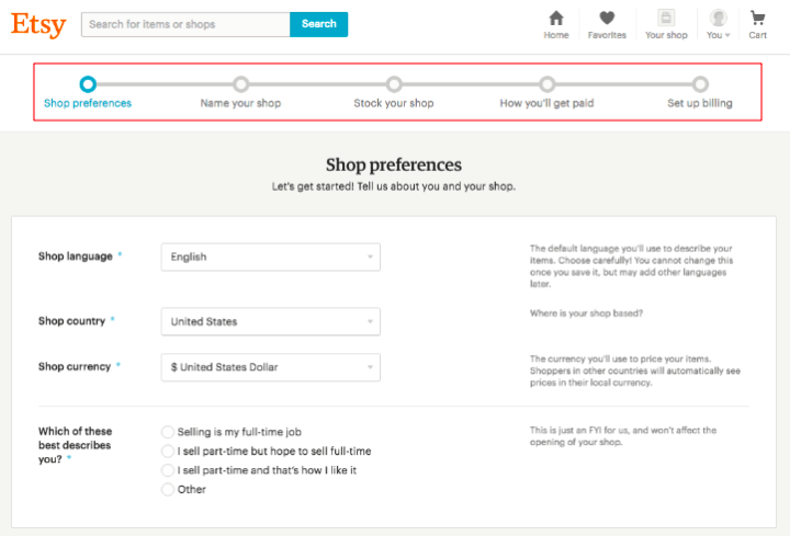
The traditional advice, here, would be to showcase a progress bar to illustrate which stage of the process the new user is currently on.
 (Source)
Again, this is a pretty standard, acceptable way of visualizing user progress. And it’s certainly better than providing no progress information or feedback at all.
The problem with this approach is its linear nature. By visualizing progress in such a sequential way — even when each step need not be completed in sequential order — your onboarding experience will revert back to its original product-centered state.
Worse yet, if a user isn’t ready to complete a certain task, they likely won’t press forward to any of the other tasks at hand — again, even if they aren’t sequential.
(Using the above example, a new user shouldn’t need to have a name for their shop before they set up their payment options. Unfortunately, this may cause many novice shop owners to second guess their entire venture.)
That said, there are ways to help new users visualize their progress without pigeonholing them into a sequential, brand-driven experience.
Checklists, for example, showcase the tasks the user has accomplished (and has yet to accomplish) — while still allowing them the freedom to choose their own path.

(Source)
Here, Acorns allows users to complete various onboarding tasks in whichever order they choose.
Yes, many of the steps are contingent on one another. The point is, the user will figure these steps out as they explore (not just when you tell them).
This slight difference in presentation reinforces to the user that they’re in control of their onboarding experience — but that they still have you to rely on for guidance as needed.
(As a quick note, linear progress bars can be used to track progress within specific onboarding tasks. For example, if an Acorns user chooses to “Turn On Round-Ups”, an in-task progress bar would help them understand what they’ll need to do.
You can also help your new users frame their progress by...well...making their growth crystal clear.
Story Chief, for example, puts experiential progress metrics front and center on their user dashboard (along with an onboarding checklist, to boot!):

(Source)
For each metric, Story Chief provides additional information to help the user understand how to improve their efforts moving forward. This can open the door for further learning based on the user’s specific needs and goals.
Injecting gamification into your onboarding experience can help new users stay motivated and comfortable — and can also help guide them to the path that’s right for them.
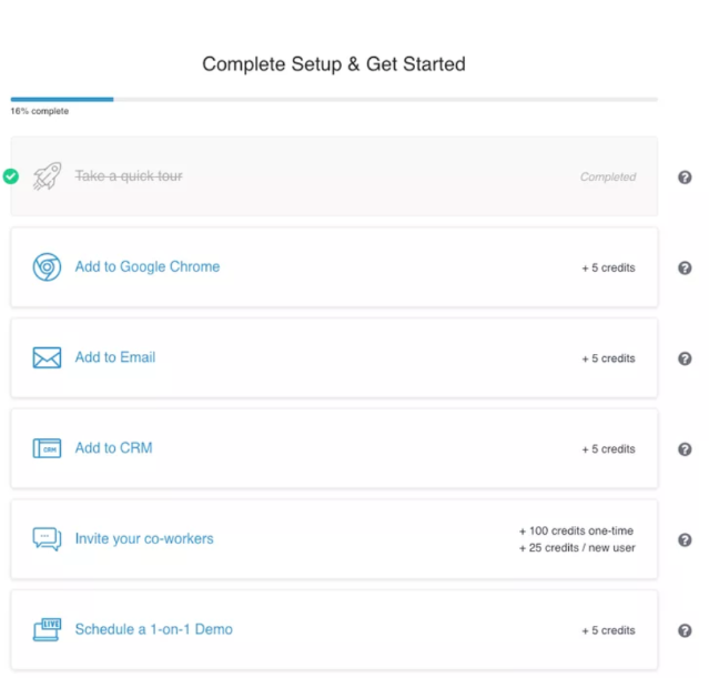
Seamless AI, for example, allows users to earn credits as they complete basic tasks, including those that help new users get more acquainted with the tool.

(Note: This type of gamification can be used to restrict access to more advanced features until a user has gotten acclimated with the basics — but to do so in a more user-friendly way. It’s a creative way to inject linear tasks into an otherwise user-driven onboarding experience).
Enabling your new users to track their onboarding progress is key to empowering them to use your product correctly and autonomously. With a clear idea of where they’ve been and where they’re headed, your new customers will be much better able to help themselves along their path to success.
Inject In-App Experiences Throughout Onboarding
The importance of keeping things in-app throughout the onboarding experience can’t be overstated.
Here’s Salesforce’s Gavin Austin again:
“If I have to leave a page to do research, I am going away… Having it right in the same place increases productivity.”
That said, it’s vital that you deliver important information to your users directly within your onboarding interface. A few ways you can do this includes making use of modals, slideouts, and tooltips.
Modals
Modals are similar to popups or overlays delivered at specific times throughout the onboarding process.

Modals allow you to deliver can’t-miss, need-to-know information to your users without detracting too much from their overall onboarding experience. Still, since they need to be closed out before proceeding, modals increase the visibility of these all-too-important messages.
Pro Tip: Because they're a bit more aggressive than modals or tooltips, use modals for big notifications and announcements, but not for tips on how to use your product.
Slideouts
Slideouts are less intrusive than modals, and typically appear near the side or corner of the user’s screen.

(Source)
Slideouts are used to give direction to new users, deliver quick-hitting tips, and offer more in-depth assistance. Still, the choice is the user’s as to how to proceed.
Tooltips and Hotspots
Tooltips and hotspots deliver more focused information regarding a certain feature or function within the product.

While these notifications are prevalent in both traditional and self-directed onboarding experiences, the difference is in how they’re presented.
In the traditional approach, it’s simply a matter of programming them to appear as needed by the presenter. A pretty standard process, to be sure.
With self-directed onboarding, behavioral triggers are needed to present the right information at critical moments in the user’s experience. Here, it’s all about anticipating the user’s actions and overall path to make this happen.
When it comes to delivering more in-depth information — and using multiple types of content to do so — you still want to keep your users within your tool whenever possible.
As shown earlier, users looking to learn more about Trello’s advanced features can often do so directly within their individual Welcome board. Even when the card points to further resources, the user is still kept within the Trello app:
Not only does the user not have to navigate away from the app, but they also have to use Trello to learn more about using Trello. So, they’re both learning via content and by actually practicing what they’ve learned — and are free to direct this learning in whichever way they choose.
(On that note, we hope it goes without saying that a comprehensive FAQ system and knowledge base is necessary to enable more in-depth learning for your users.)
With all this being said, there will be times where your new users will need to move away from your tool to further their learning. Which brings us to the last section...
Stay Within Arm’s Reach
As much as you want to give your new users freedom to explore your product, you still need to be able to lend support at any given moment.
The good news, though — that is, if you’ve created the support structures we’ve discussed thus far — is that you’ll be better equipped than ever to lend this support.
Still, instead of providing hands-on support at all times, your first course of action should be to lead the user to the support they need.
Often, this can be as simple as pointing them toward relevant and helpful on-site content. Chatbots and other such tools can further streamline the content-delivery process — and will keep hands-on support instances to a minimum.
Once you’ve created these more automated support structures, you can then shift your focus onto the “big picture” areas that do require hands-on support from your team.
Here, you’ll need to:
- Create or improve instructional content surrounding the task at hand
- Prepare your support staff to effectively guide users through the process
- Determine the best way in which to deliver effective support as needed by your users
This also involves identifying behavioral triggers that signal a need for help. When it’s clear that a user simply can’t make progress in a self-driven manner, you need to know to step in. otherwise, the user’s journey could end then and there.
Overall, your goal when delivering a self-service onboarding experience is to be Gandalf to your customer’s Frodo: While they’re mostly able to make headway on their own, you’ll always be right around the corner when they need you most. From there, a little course-correction (and a bit of in-house magic) is all it will take to get the user back on track.


